National Geographic · Brand Identity · Visual System · Motion Language
Further
A visual language designed to make National Geographic's spirit of science, exploration and adventure recognizable across every touchpoint.
Tools
- After Effects
- Cinema 4D
- Illustrator
- Photoshop
Overview
Further was more than a tagline
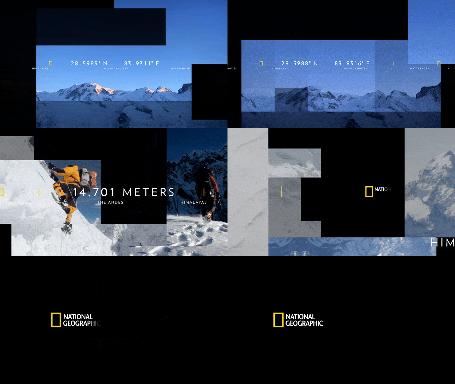
It became part of a broader National Geographic visual language designed to translate the brand's core behaviors into a system that could work across campaigns, digital content, advertising, print, presentations and motion.
The big idea
The system begins as a way of seeing, not a graphic device
Science
- Observe
- Measure
- Quantify
- Navigate
- Calibrate
Becomes — Index
Exploration
- Discover
- Frame
- Focus
- Expand
Becomes — Mapping
Adventure
- Blaze a Trail
- Go Deep
- Break Through
Becomes — Z-depth
Behavior becomes design
Behavior becomes design.
- Behavior
- Visual principle
- Application
Index — observation, measurement and information. Mapping — discovery, framing and the larger picture. Z-depth — forward movement through space.
Index
Turning information into identity
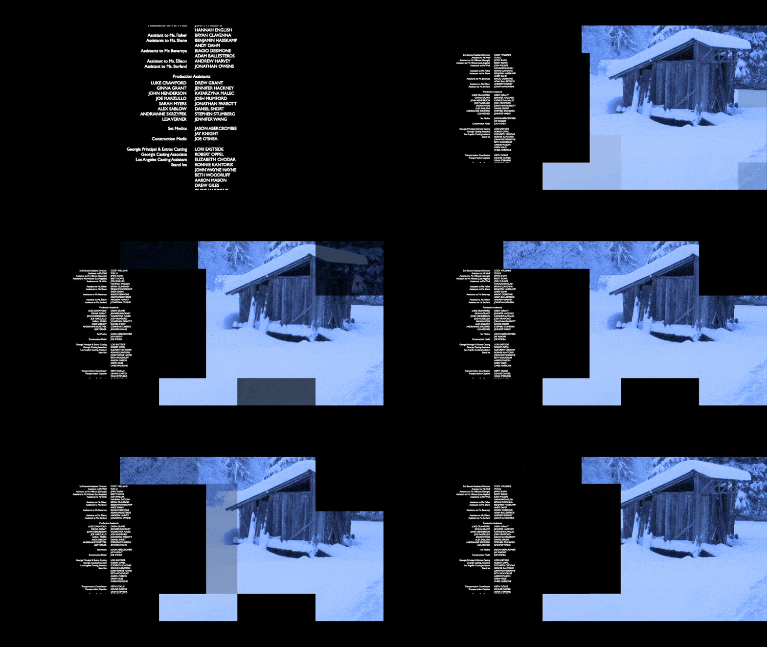
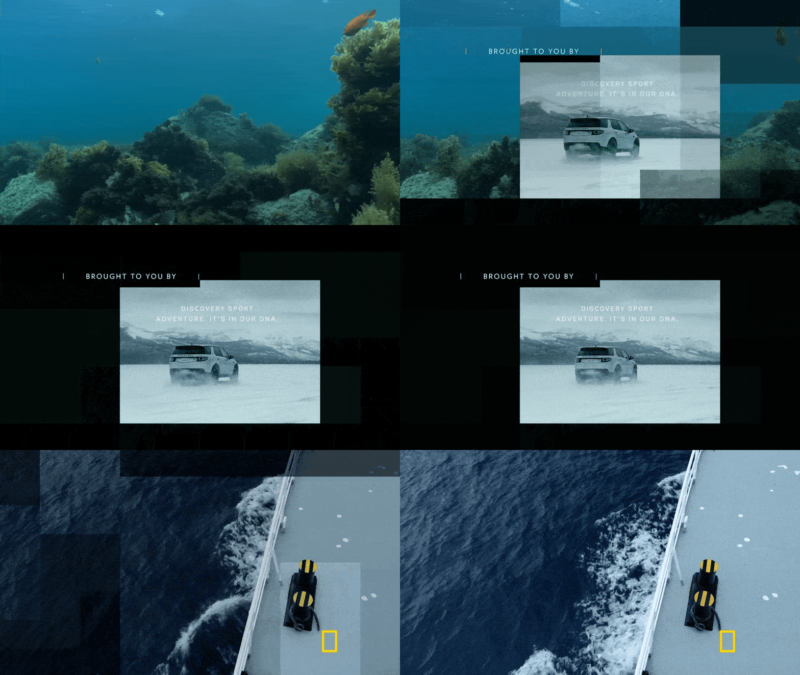
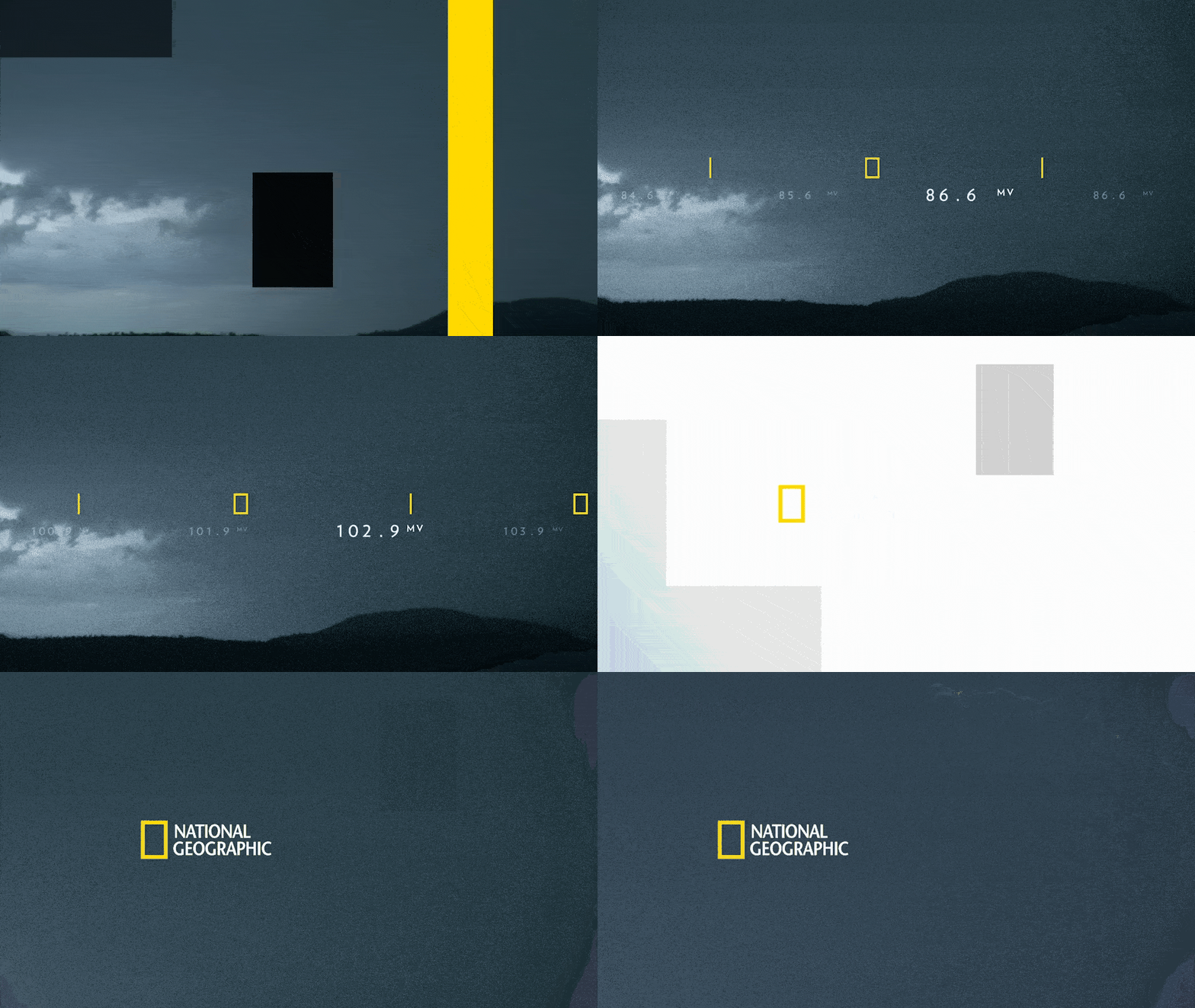
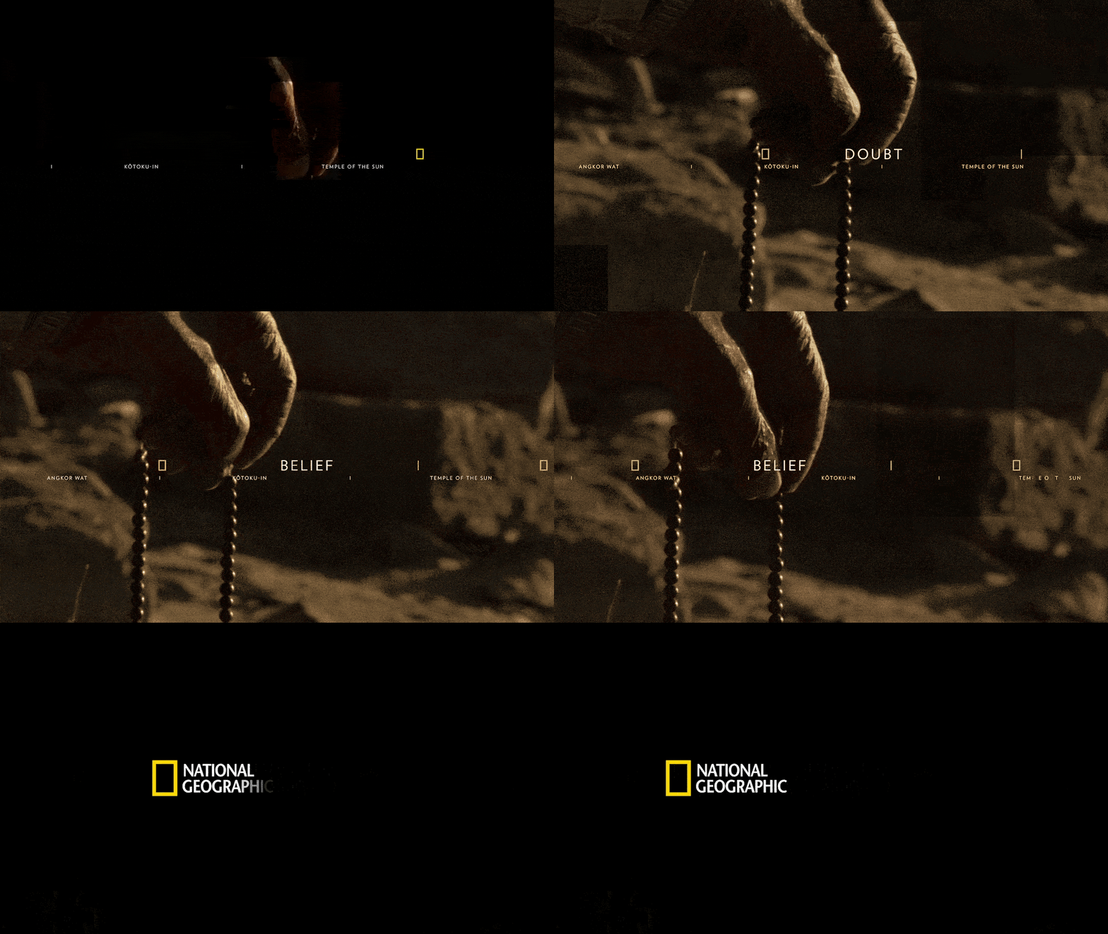
The Index translates National Geographic's scientific behavior — observing, measuring and quantifying — into a visual language built from coordinates, distances, titles and data.
Index


Mapping
Revealing the bigger picture
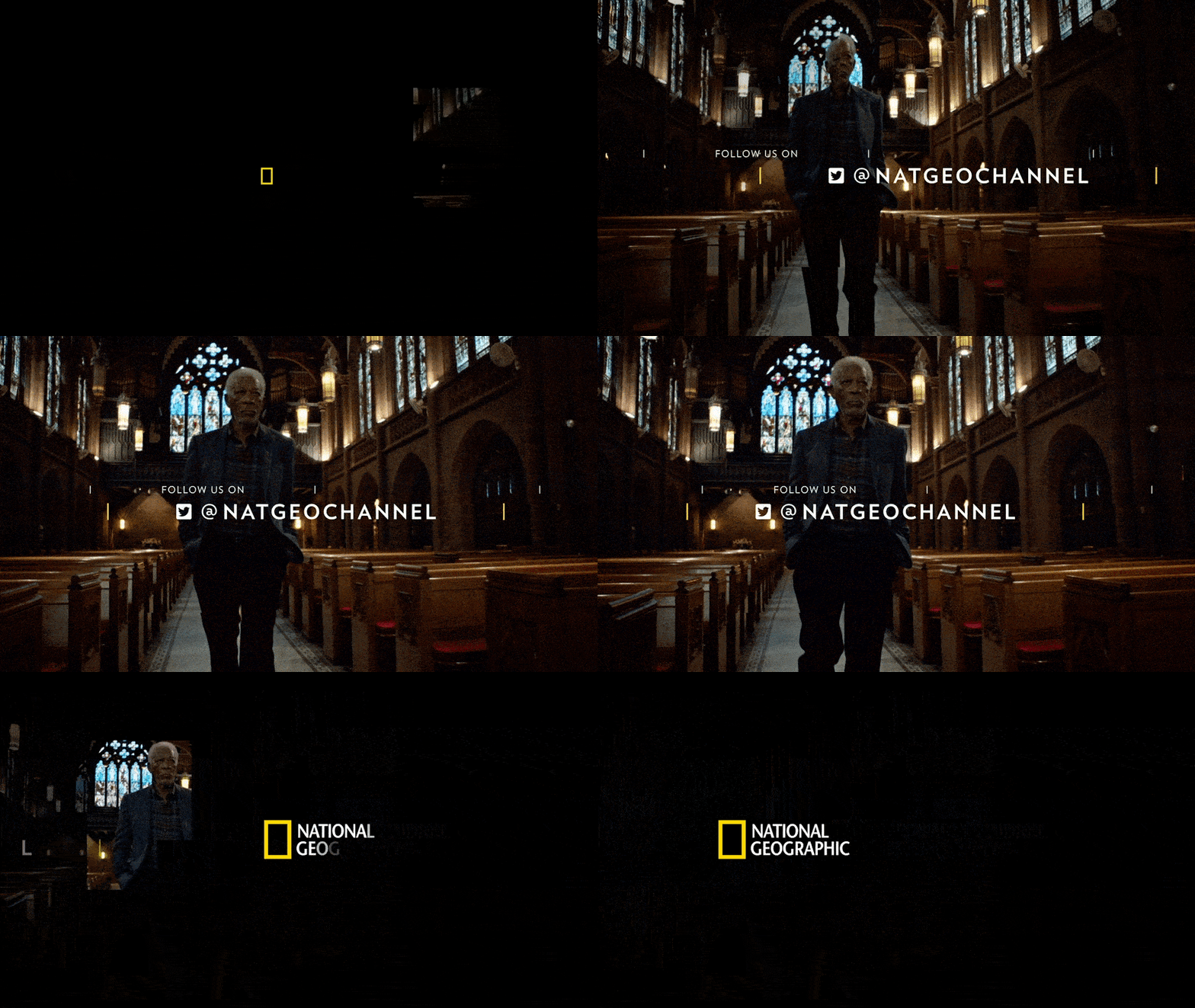
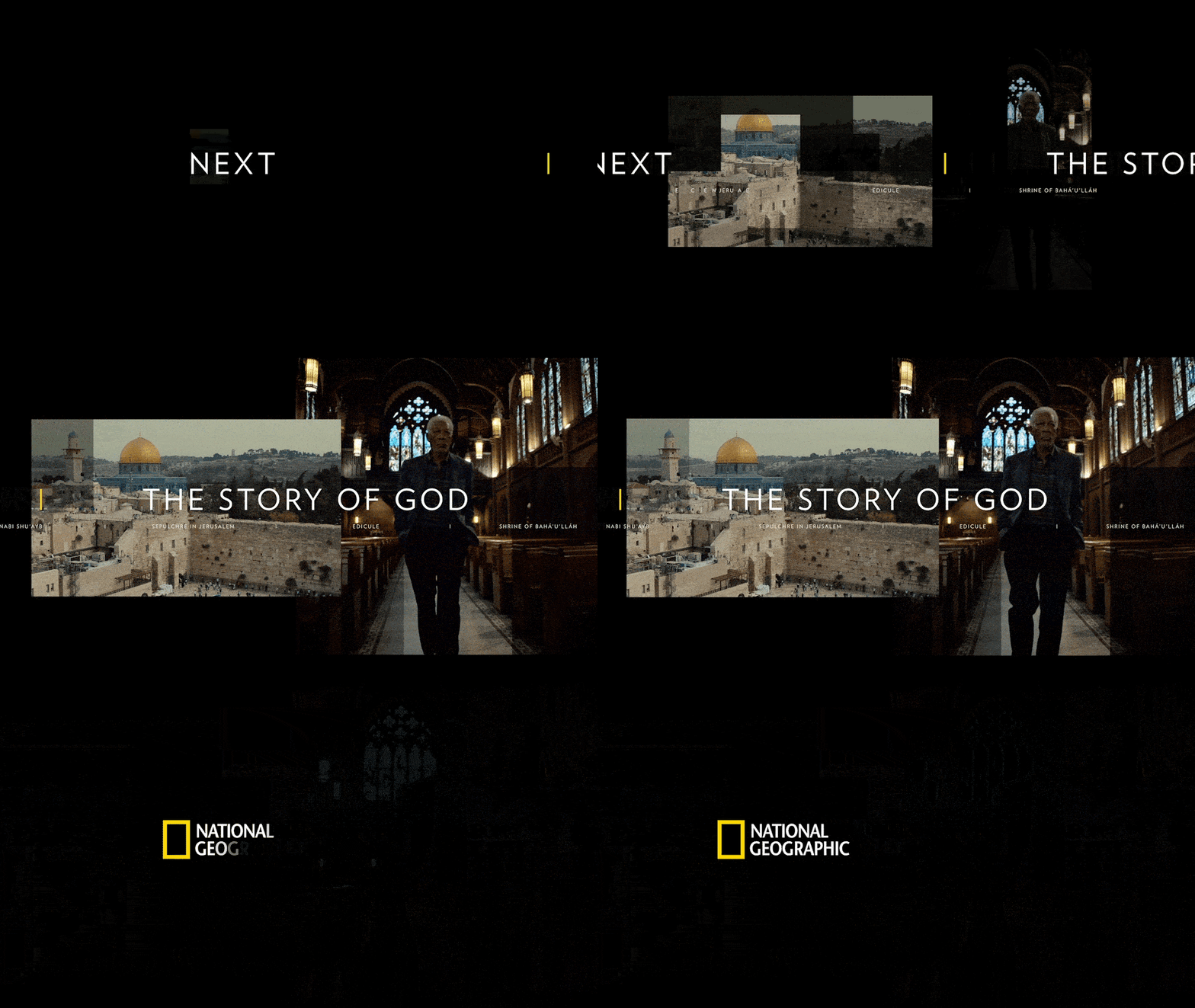
Mapping translates discovery, framing and expansion into a modular image system — images cropped, revealed and expanded to expose a larger picture.
Mapping

Motion
Always moving forward
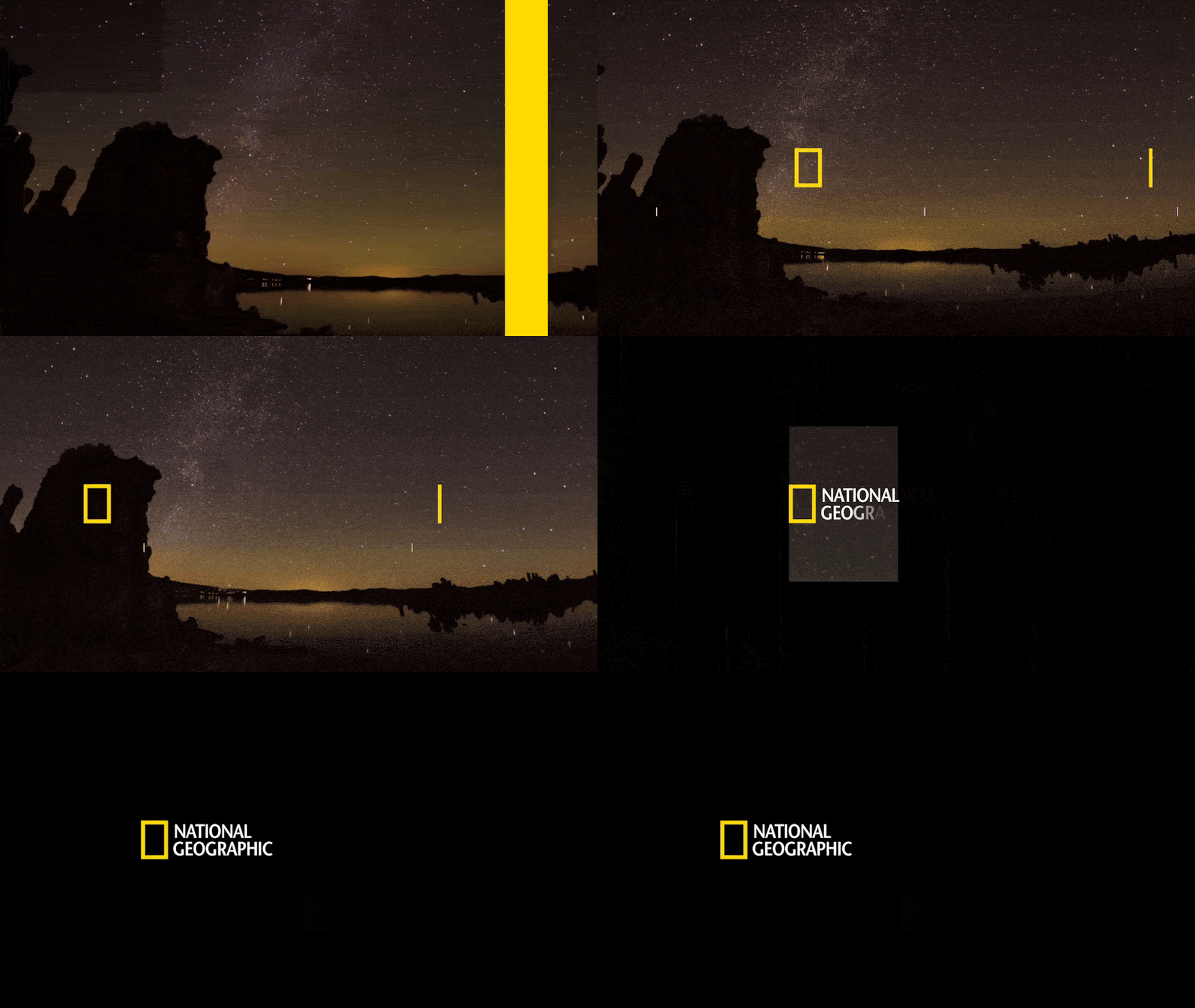
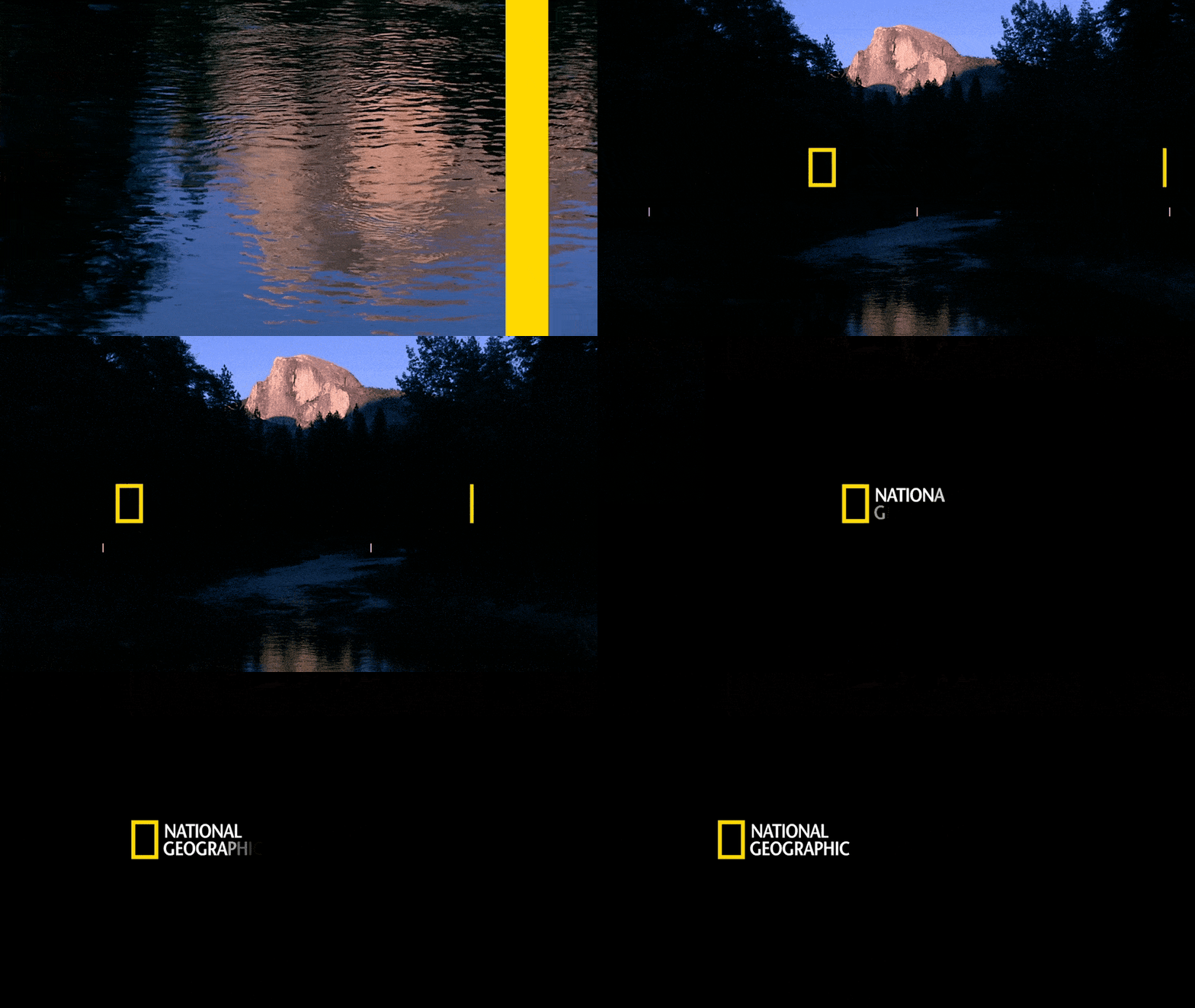
Movement was tied directly to exploration and adventure. The system moves horizontally through information and forward through Z-space, creating the feeling of discovery, progress and moving deeper into the story.
Motion


Motion
Photography
The human scale of exploration
Photography carries the emotional weight of the identity. Human scale, unusual perspectives and expansive environments keep the system rooted in real exploration rather than graphic abstraction.
Photography

Foundation
A restrained foundation
A restrained typographic and color foundation — Geograph, black, white and National Geographic yellow — allows photography, information and movement to carry the personality of the system.
Black
White
National Geographic Yellow
Photography
Scale
One vocabulary. Many surfaces.
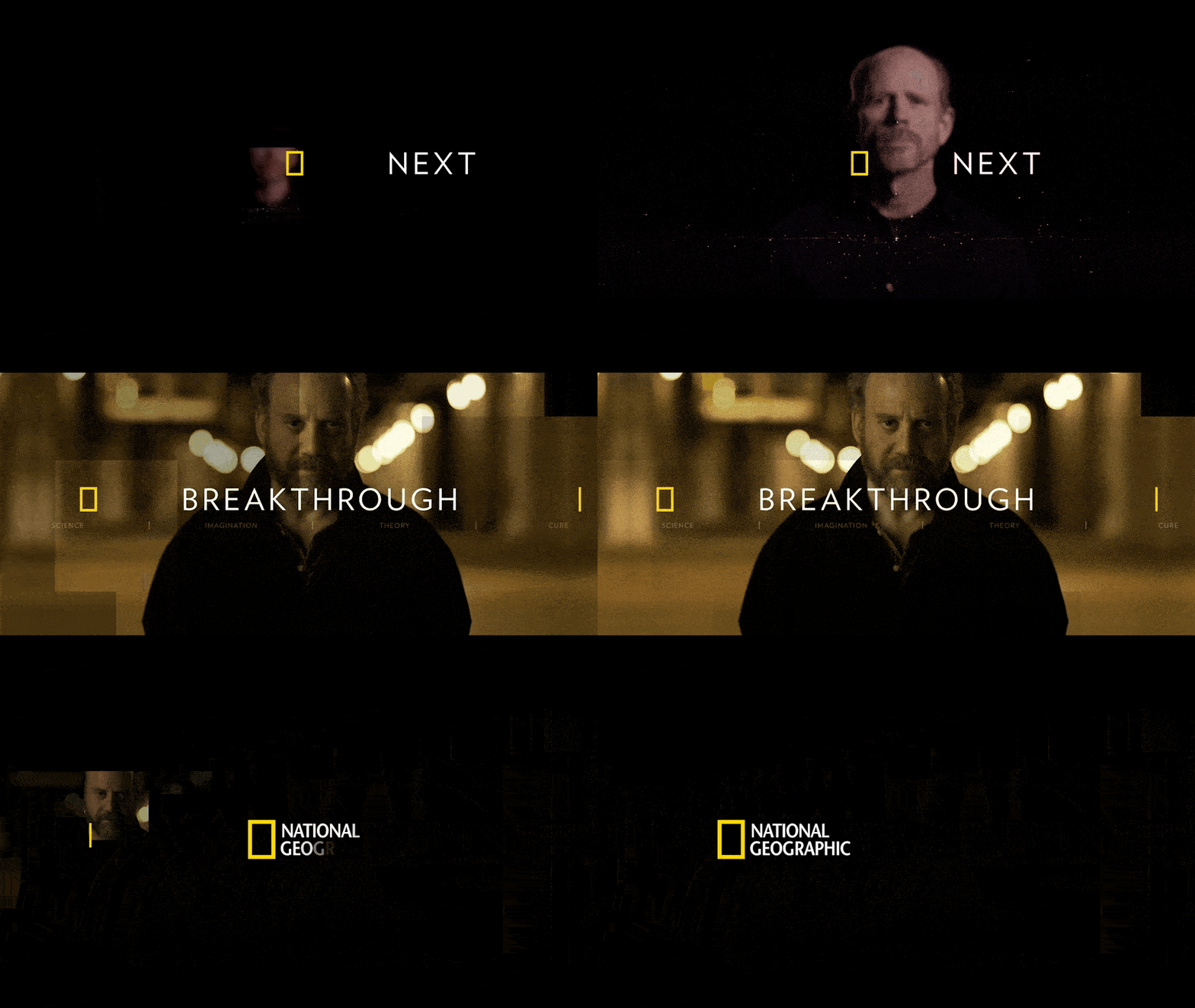
The same system reads as one brand across campaign, on-air, digital, information-rich communication and presentations.
The system in use

MY ROLE
Applying and extending the system in practice
Working within National Geographic's master-brand direction, I translated its behaviors into designed and animated work and extended the system where new formats required it.
“The measurements, the maps and the movement were not decoration — they were the brand behaving on screen.”
The work
Supporting artifacts
Frames, templates & documentation