National Geographic Expeditions · Global Brand System & Creative Direction
Expeditions
Evolving a complex travel portfolio into a cohesive National Geographic brand experience across products, partnerships, print, digital and motion.
Tools
- After Effects
- Premiere
- Figma
- Illustrator
- Photoshop
The challenge
One of the world's most recognizable brands, taken into travel
National Geographic Expeditions held multiple travel products, programs and strategic partnerships under one name.
The work was to give those experiences enough distinction to communicate their individual character while ensuring every expression continued to strengthen National Geographic.
“One brand. Many ways to explore.”
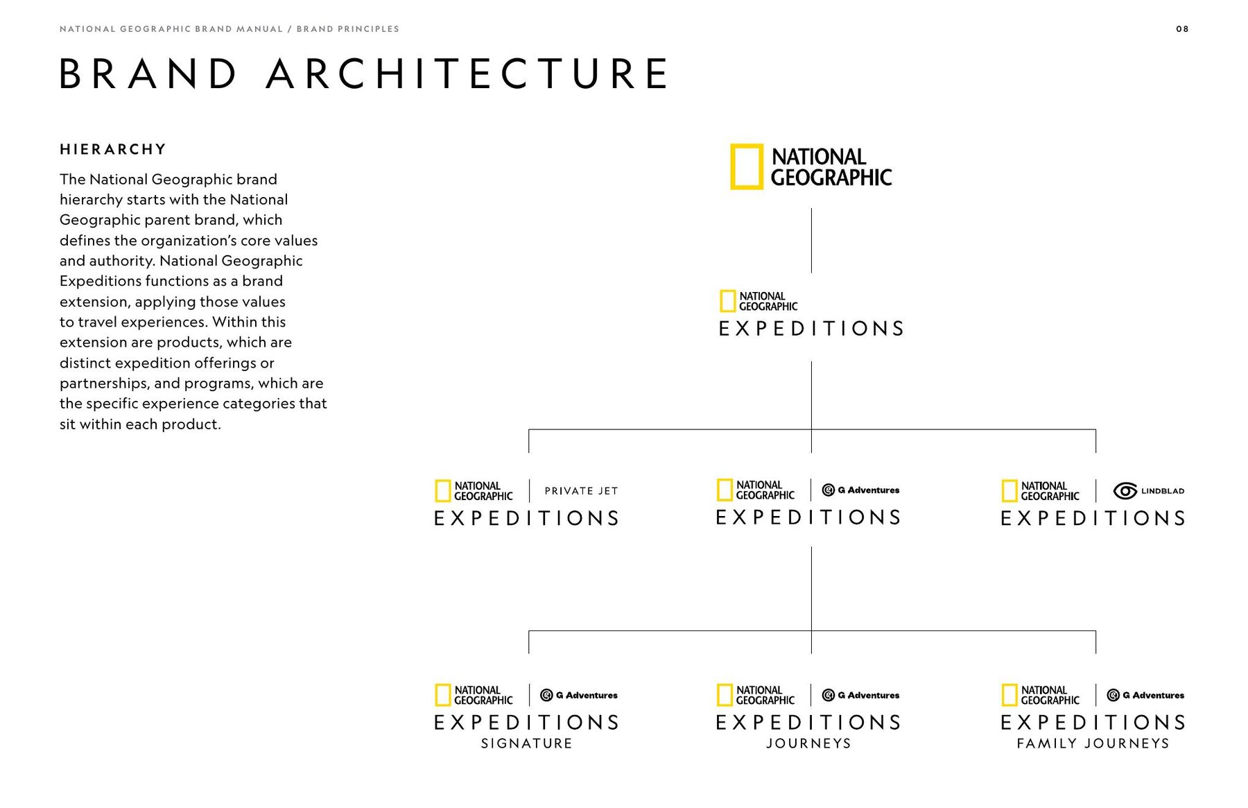
Brand architecture
Distinction that points back to the parent brand
01
National Geographic
02
National Geographic Expeditions
03
Products + partners
- Expeditions by Private Jet
- National Geographic–Lindblad Expeditions
- National Geographic Expeditions with G Adventures
04
Programs
- Signature
- Journeys
- Family Journeys
Brand architecture
The visual system
Different experiences. One recognizable system.
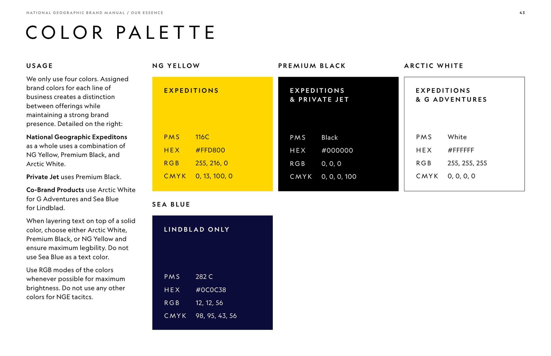
Four elements create differentiation across the portfolio while holding shared National Geographic DNA.
- Grid
- Photography
- Color
- Type
The visual system
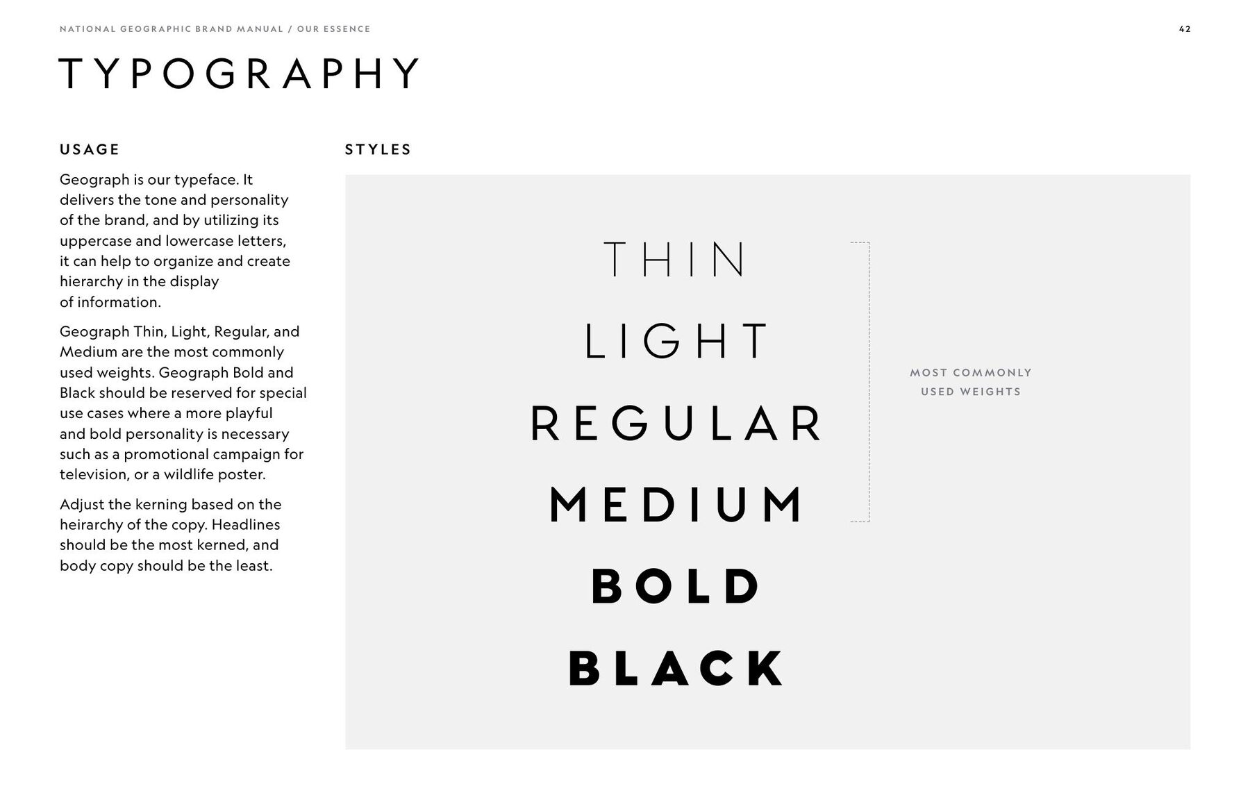
The grid
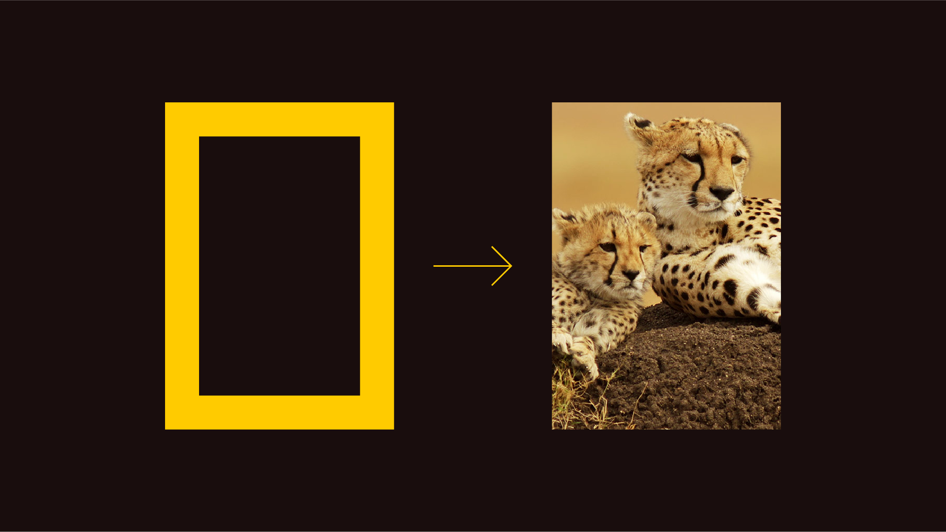
A structure built from the brand itself
The grid uses the proportions and repetition of the National Geographic Brand Mark to create recognizable portals into different expedition experiences.
The grid
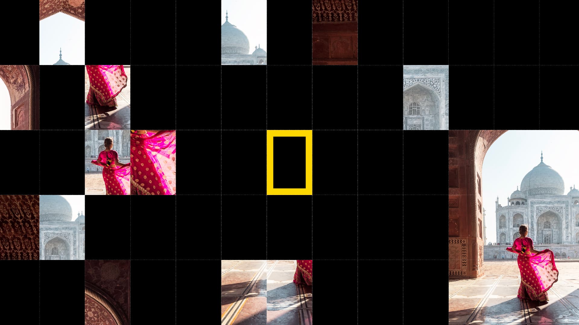
The grid in application

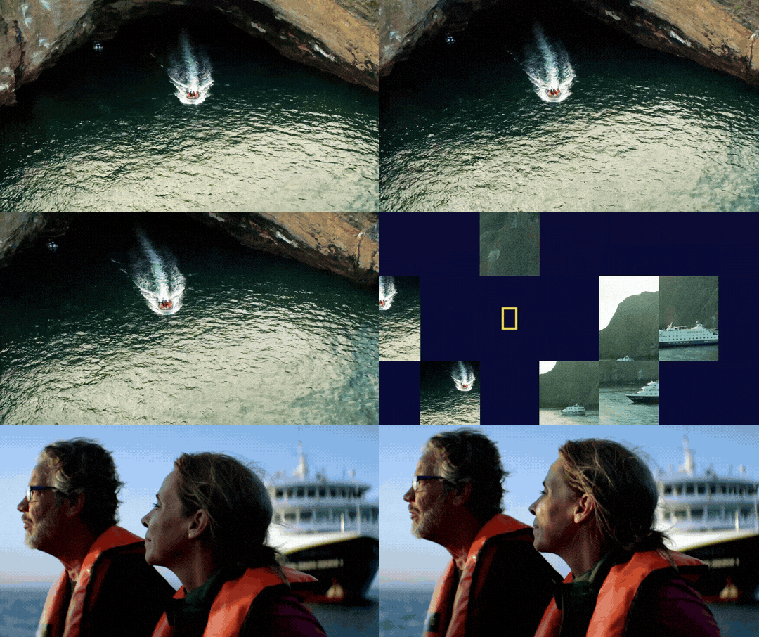
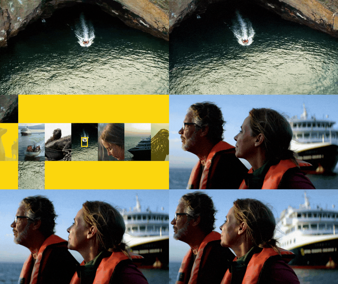

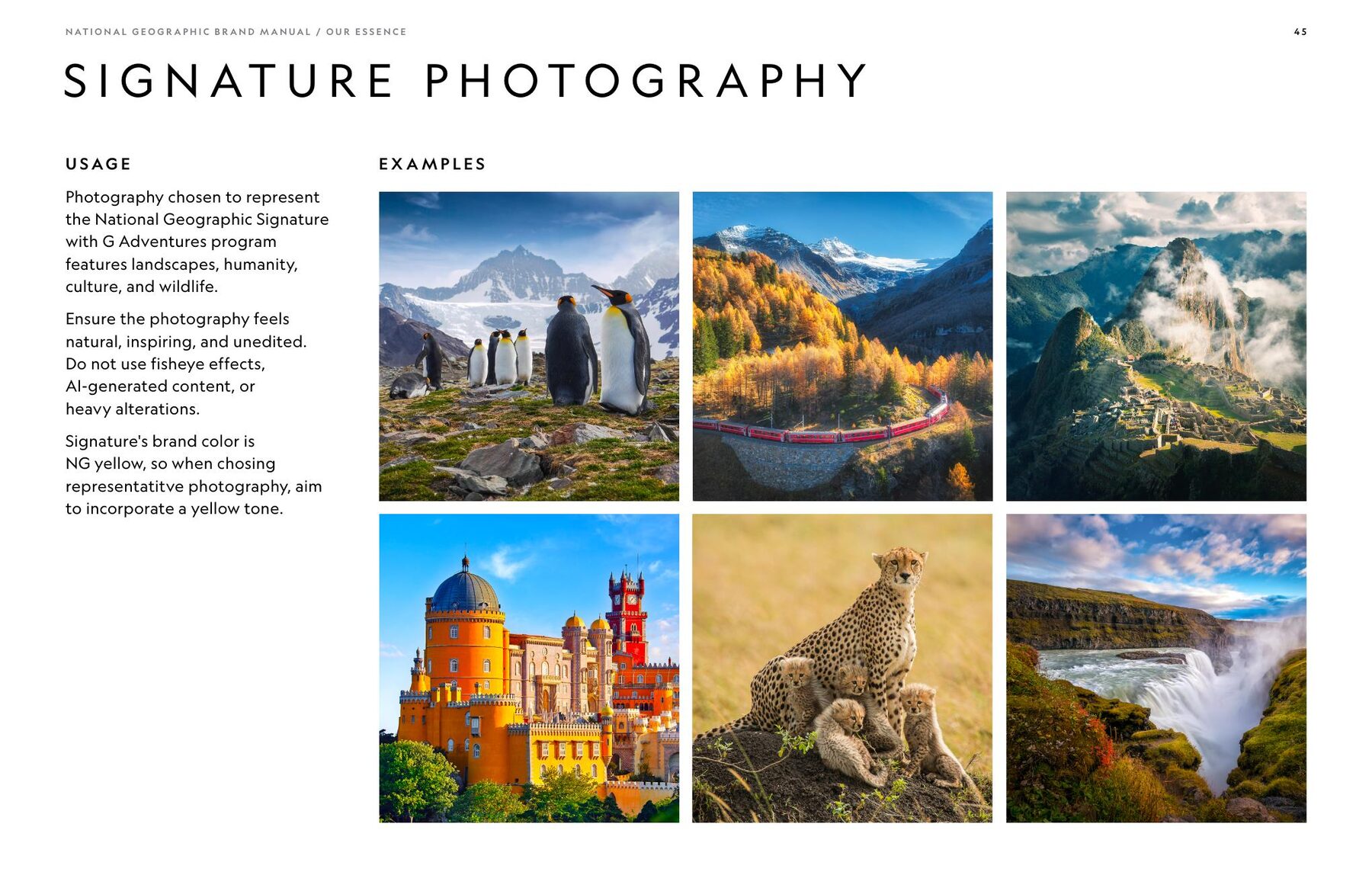
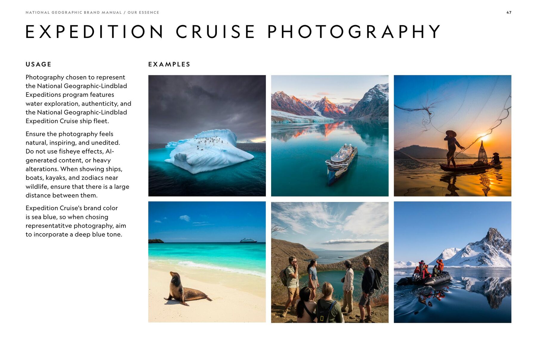
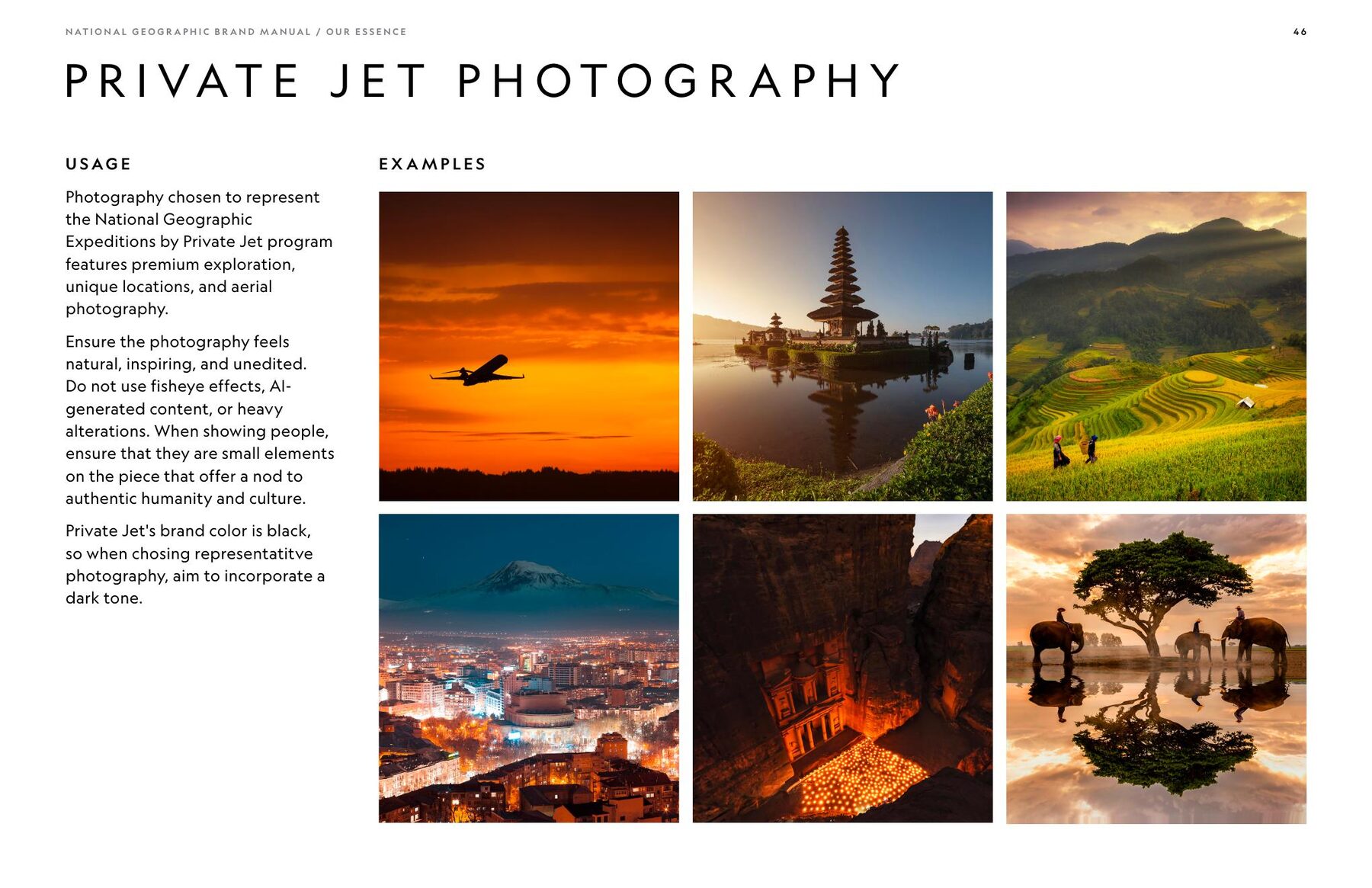
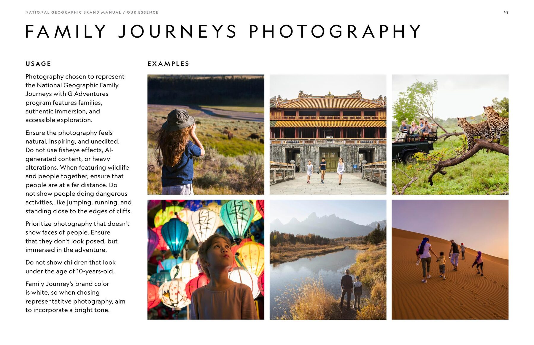
Photography
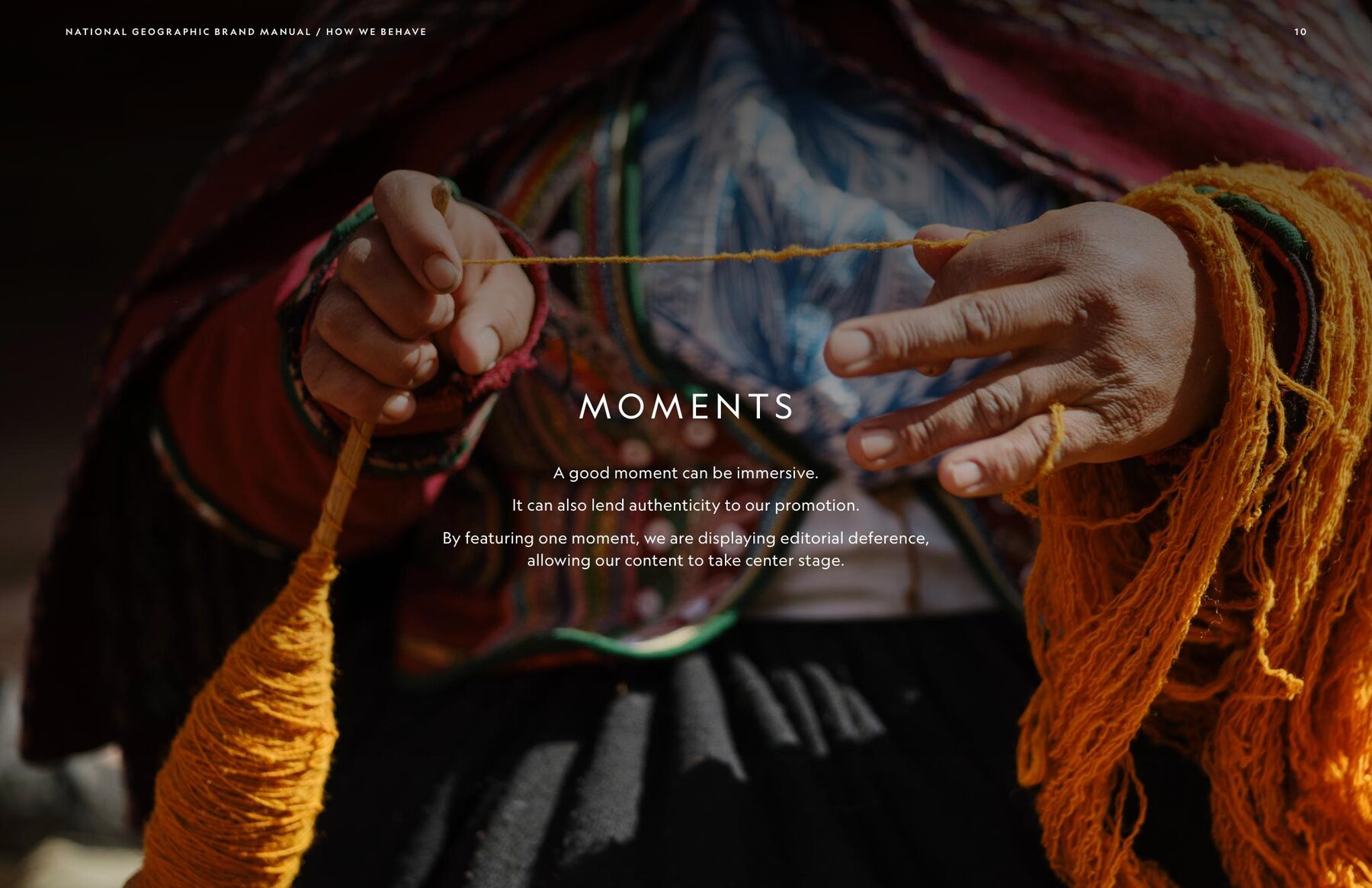
Natural. Inspiring. Authentic. Immersive.
Photography
Motion
A brand built to move
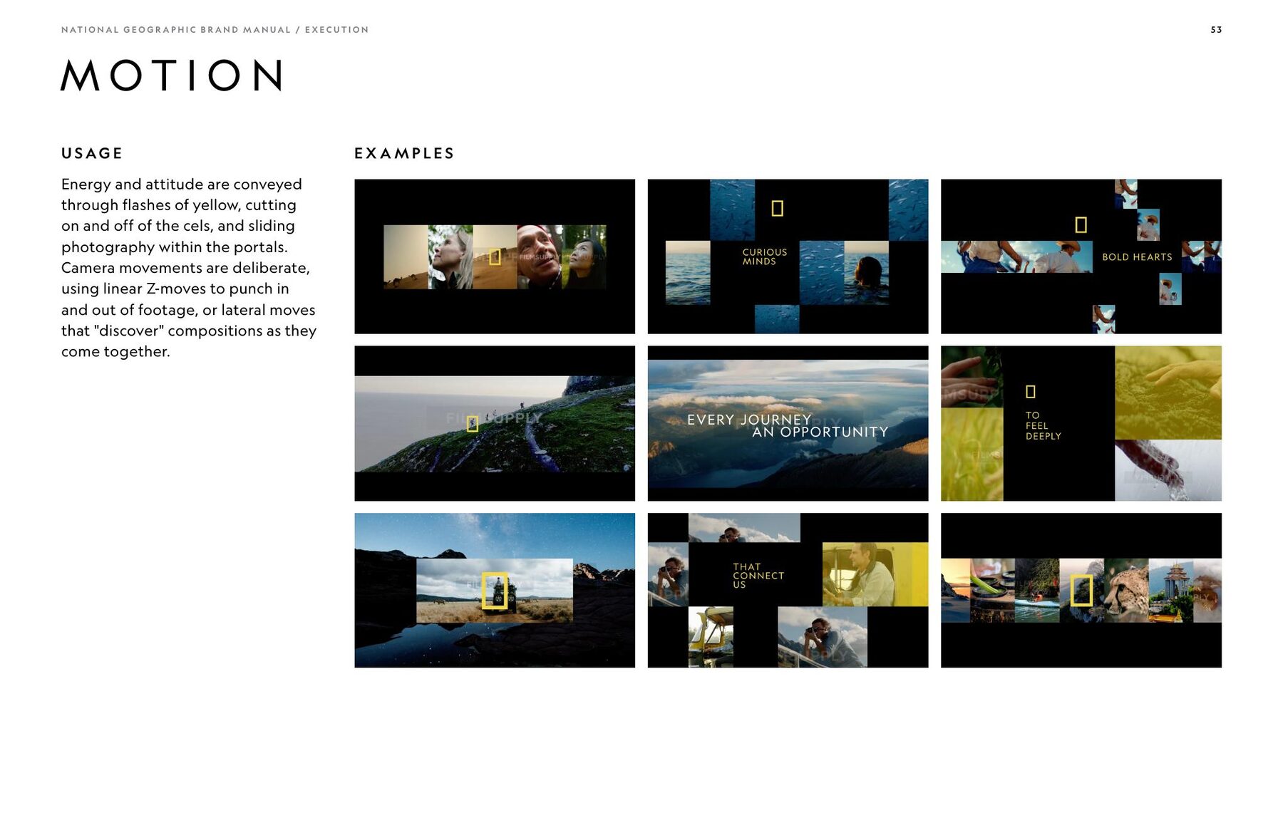
The same visual principles extend into motion through image portals, controlled camera movement, typography, transitions and flashes of National Geographic yellow.
Motion
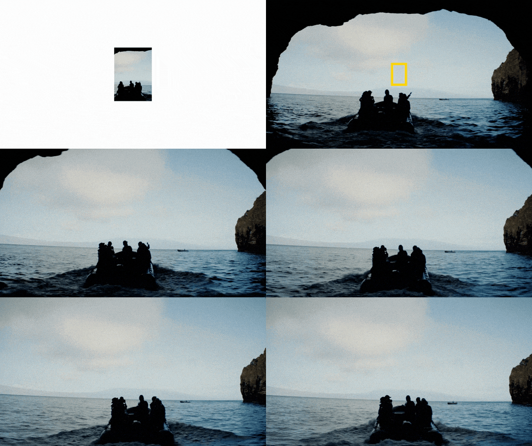
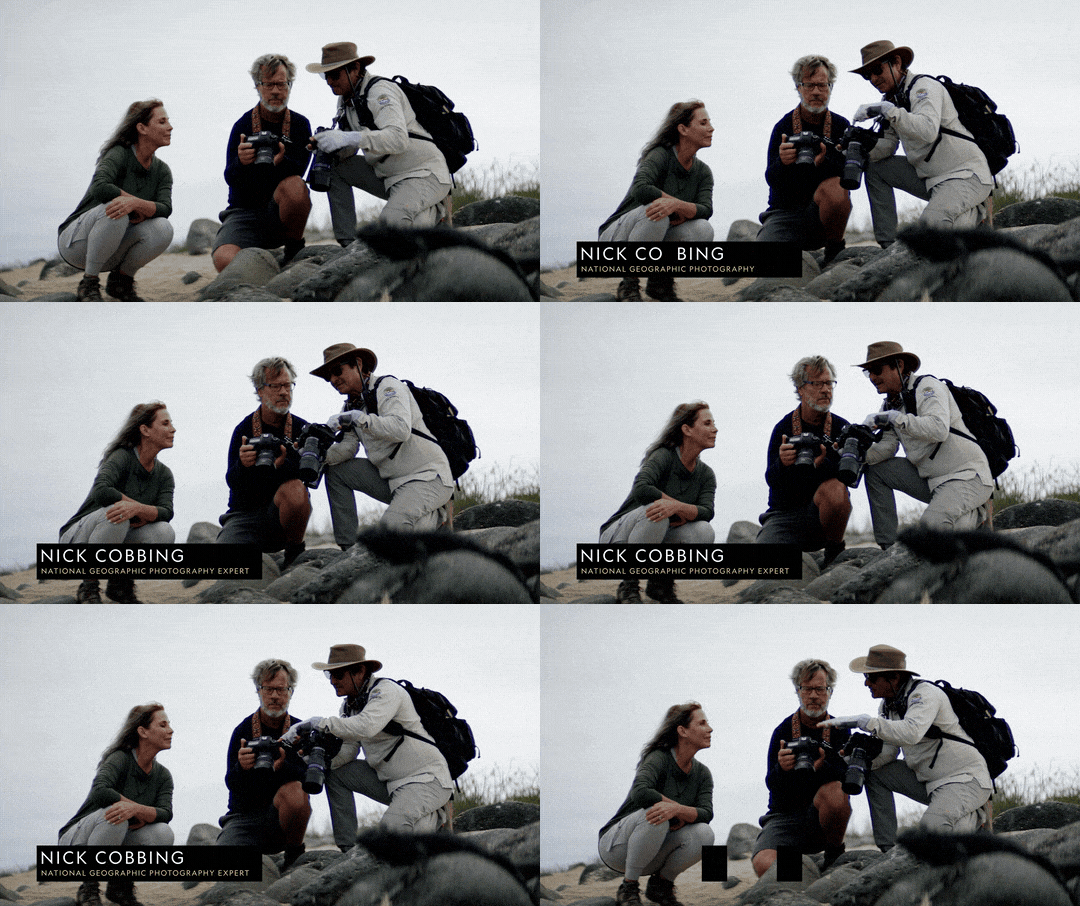
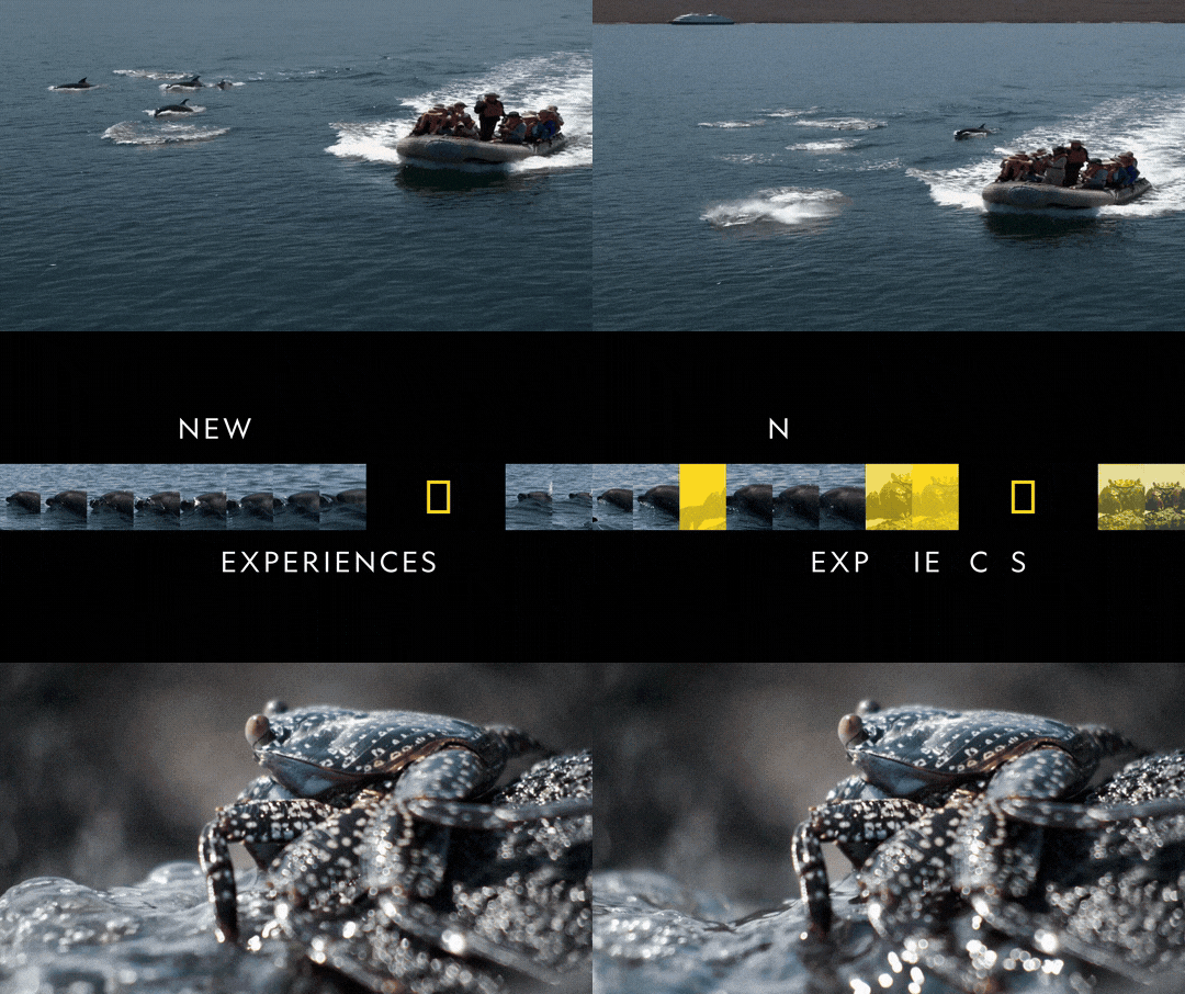
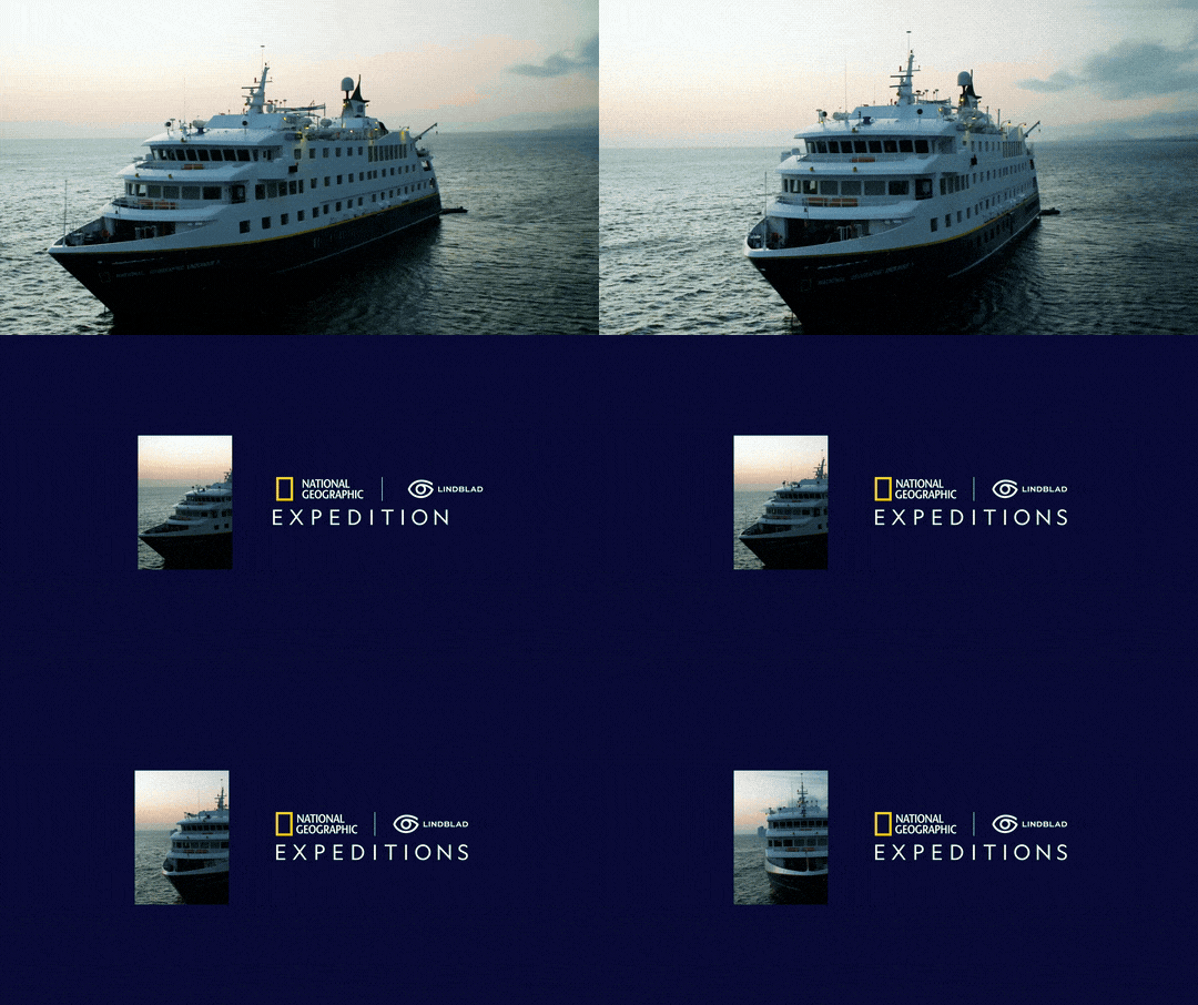
Motion system
Built to scale
One system. Every touchpoint.
Built to scale
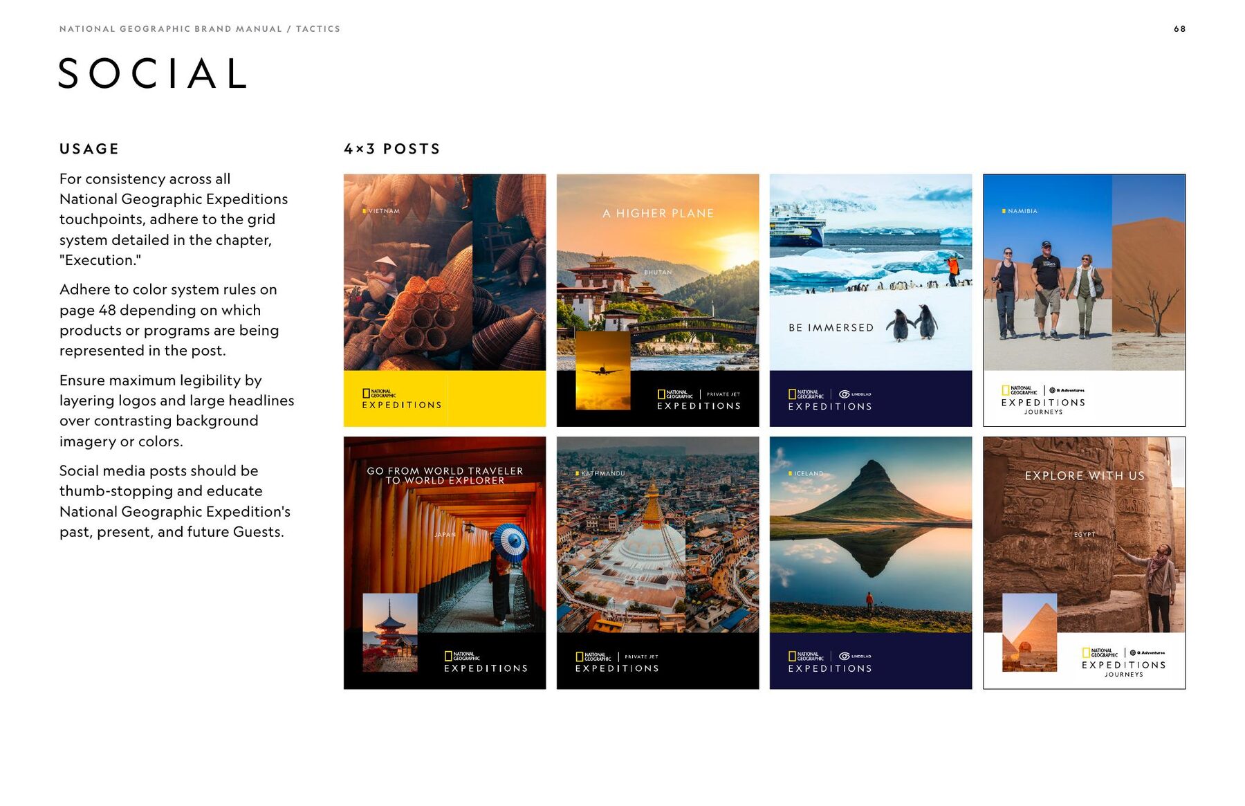
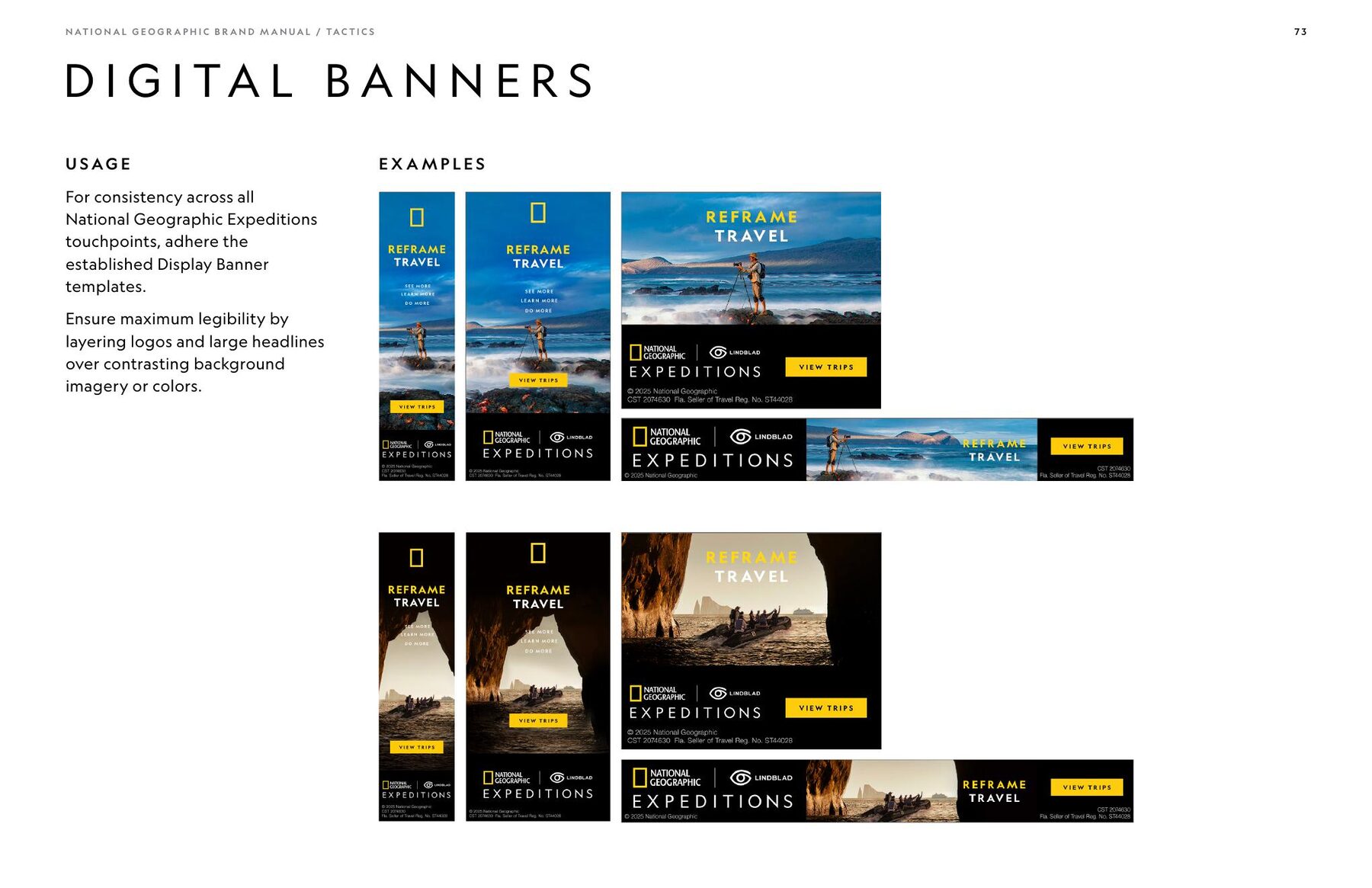
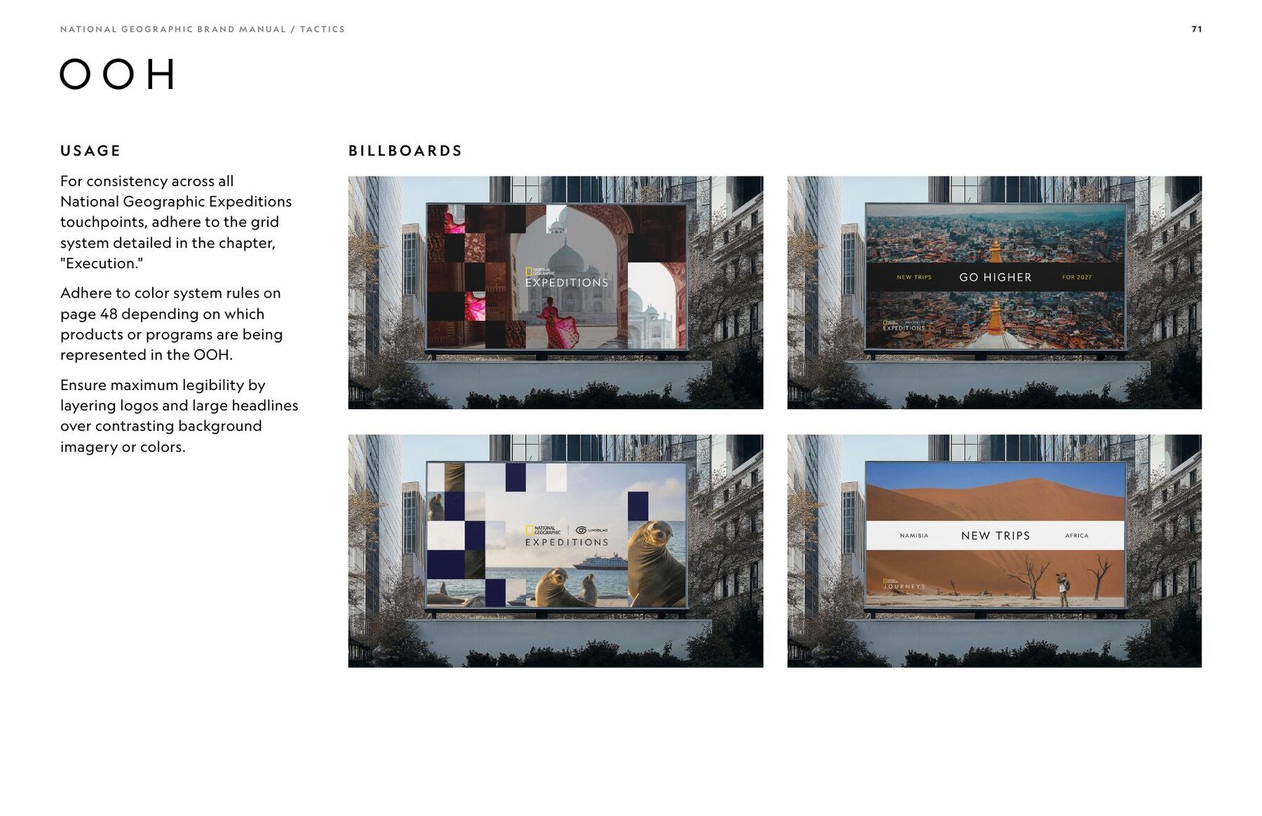
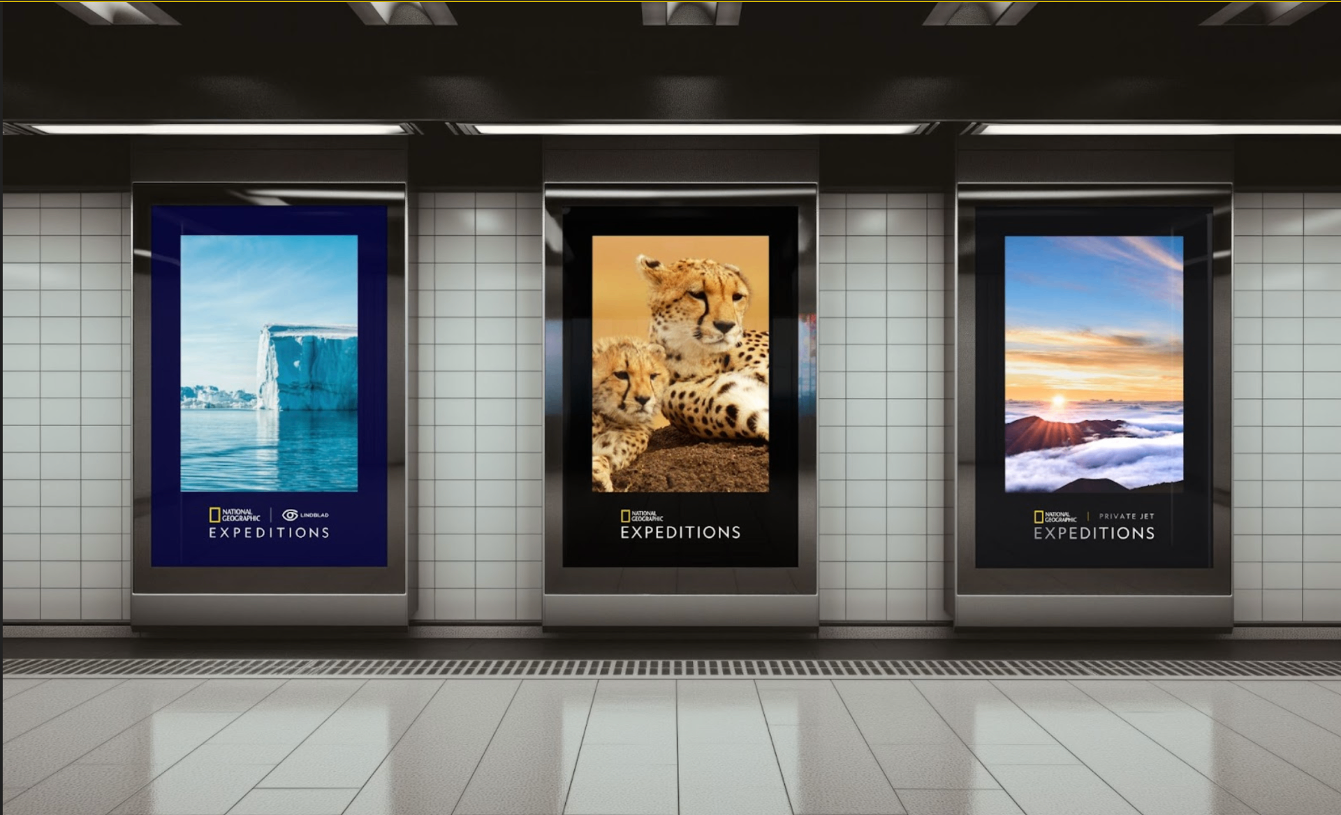
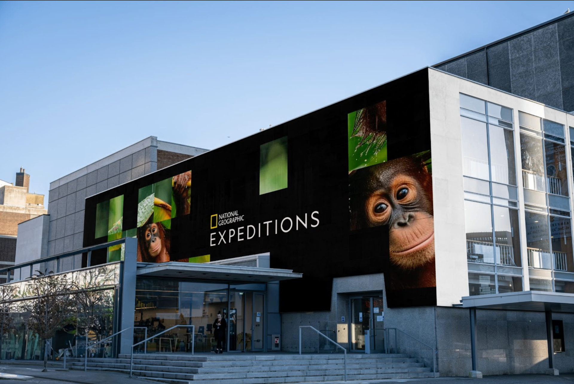
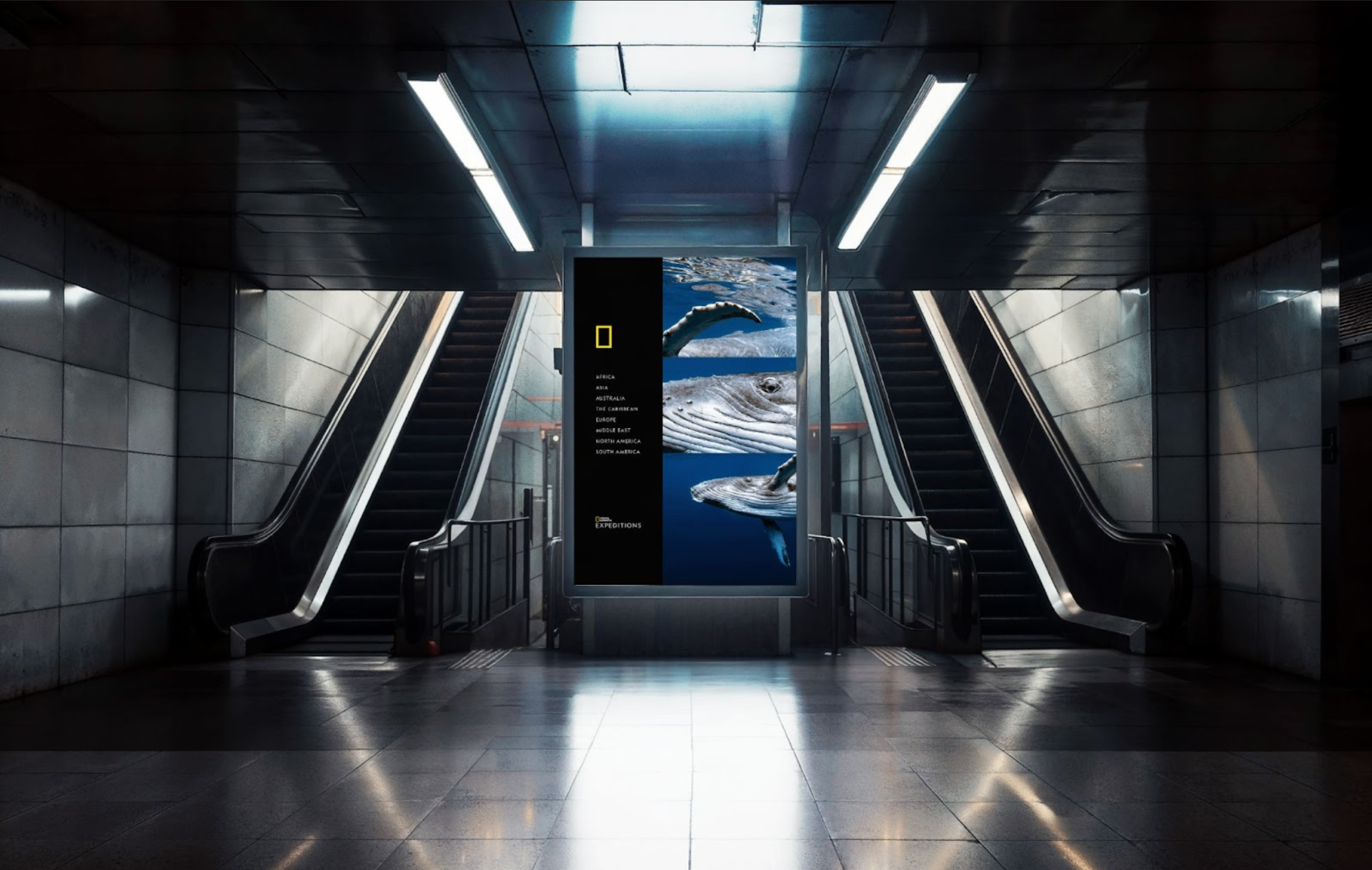
Out in the world
Out in the world
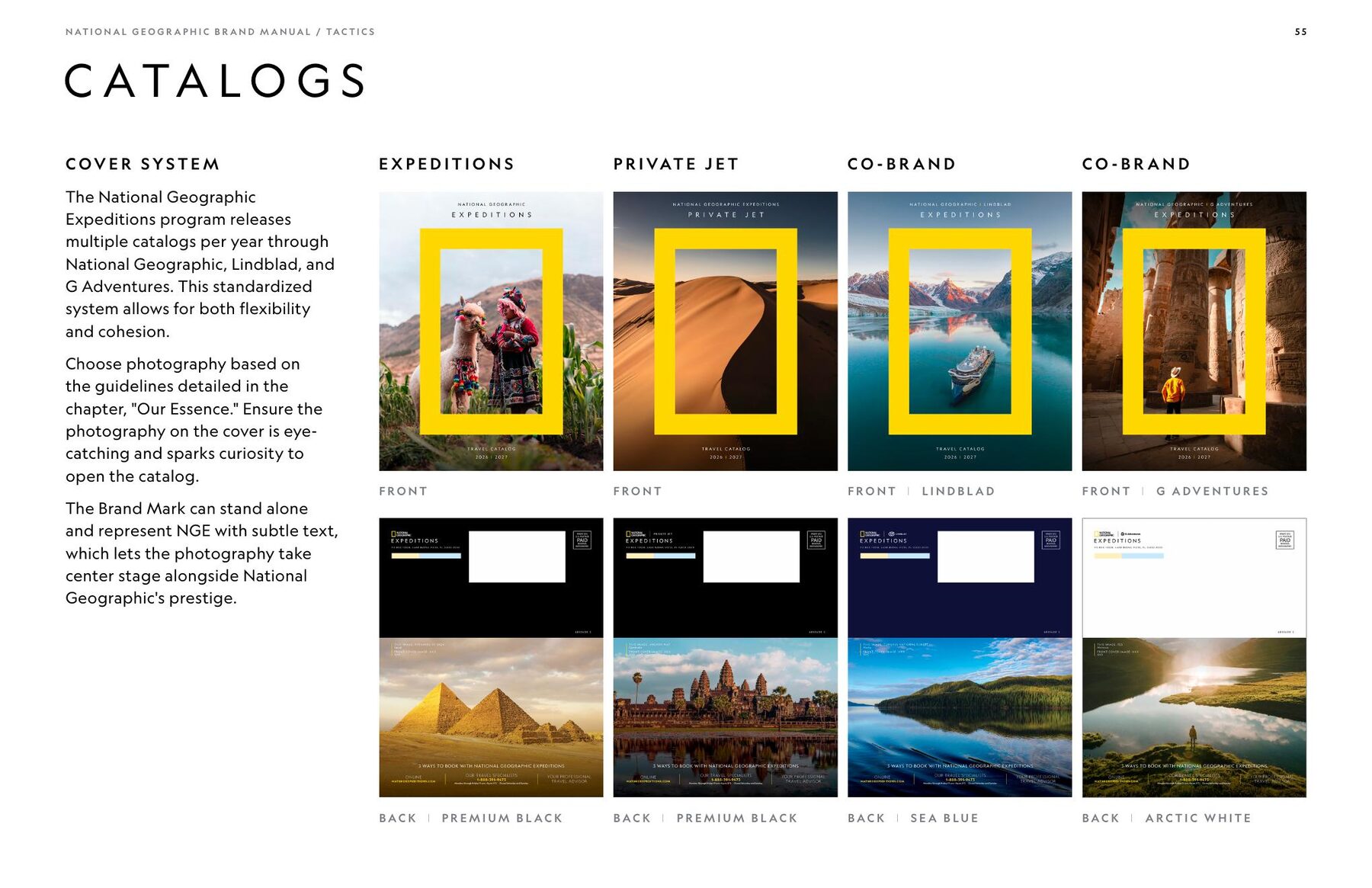
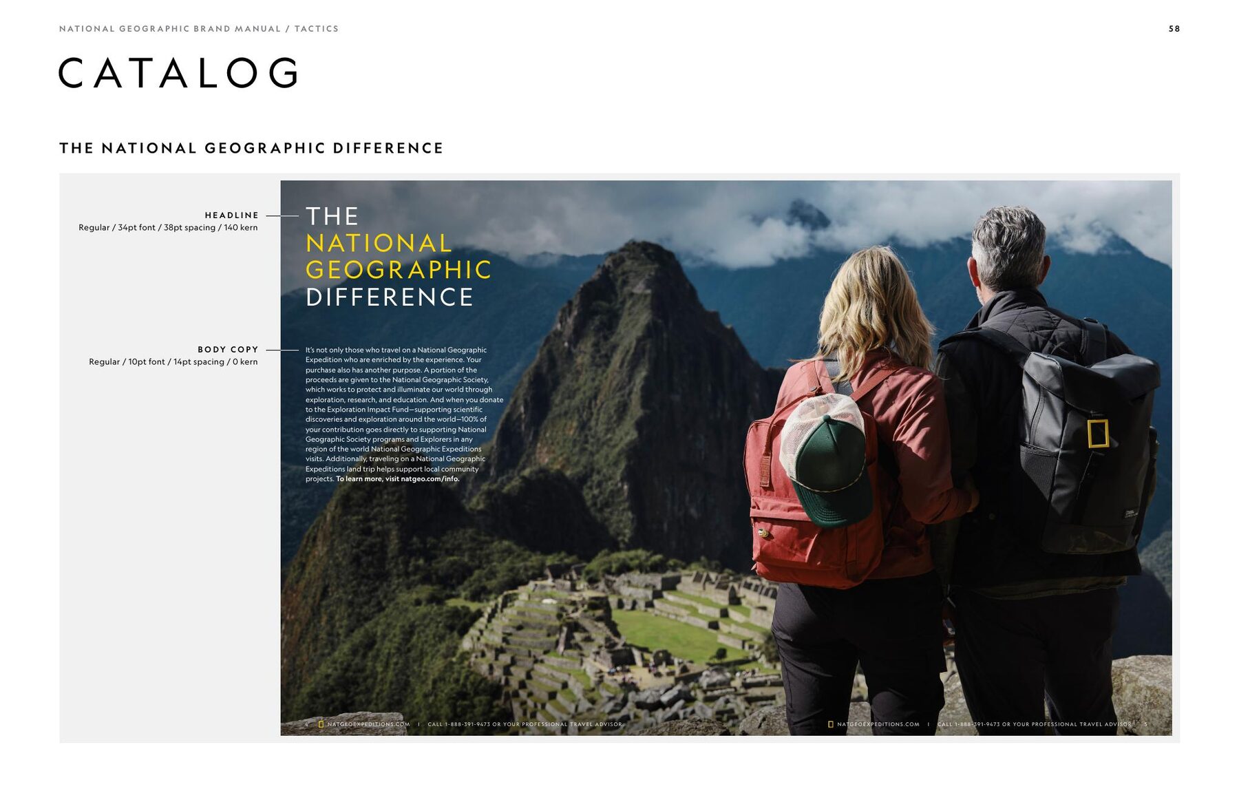
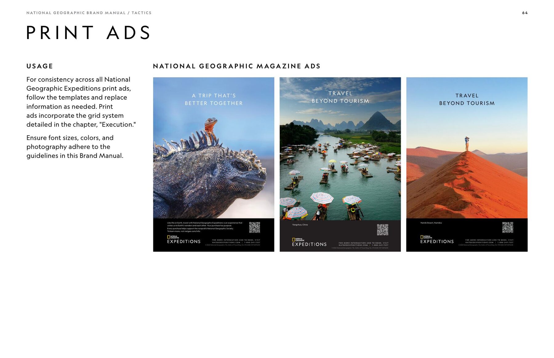
The same system scaled from intimate customer communications to large-format brand experiences.
Out in the world
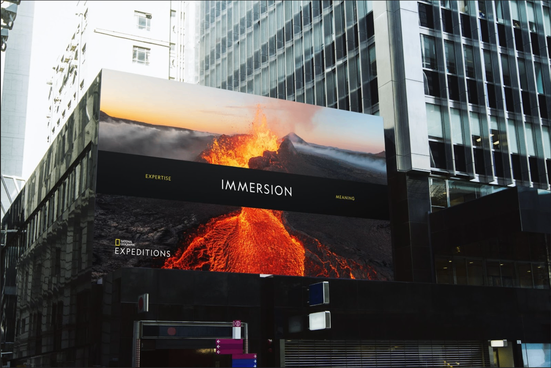
Partnerships
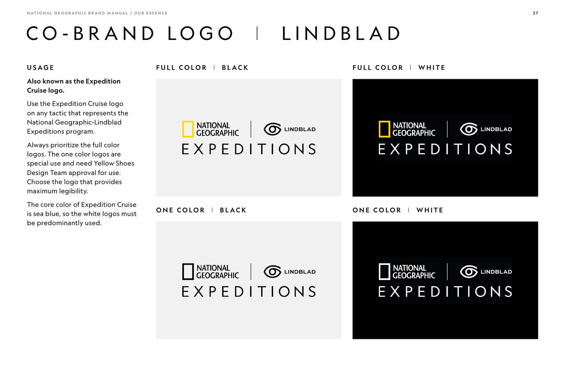
One brand system. Multiple partners.
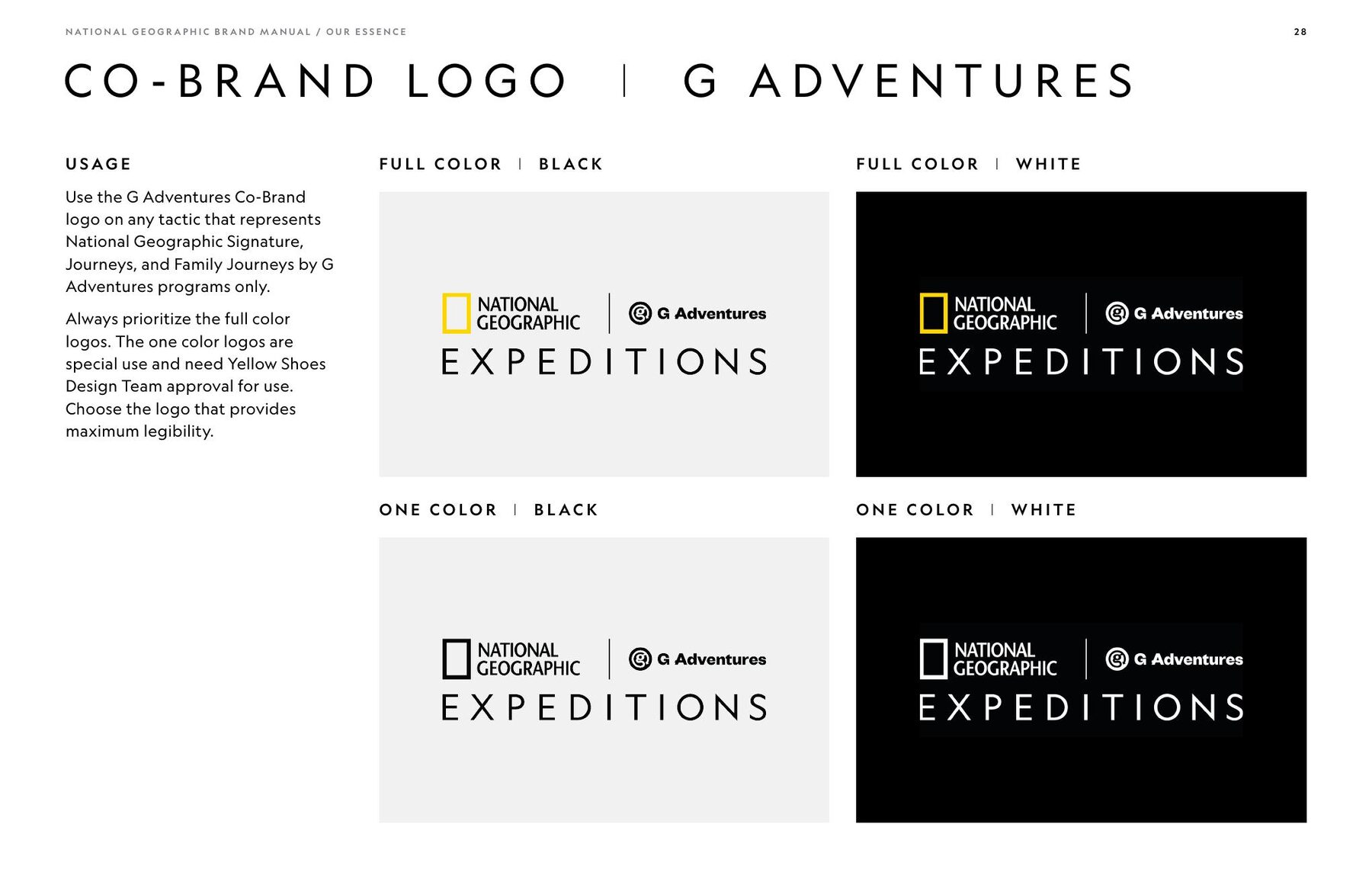
Strategic partnerships required National Geographic, Lindblad and G Adventures to coexist within a shared system while preserving clear hierarchy and National Geographic brand equity.
Partnerships
Brand governance
From design system to working system
The work extended beyond individual executions into standards, templates, motion guidance and partner resources that let teams apply the identity consistently.
MY ROLE
Creative lead across the Expeditions ecosystem
My contribution ran across the ecosystem — brand evolution, creative systems and hands-on execution — rather than being limited to individual deliverables.
Scale
Built for volume
- Pieces of Expeditions direct-mail communication annually
- 2M+
- Pieces per major catalog mailing
- 50K–250K
- Unified within one visual ecosystem
- Multiple product lines
- National Geographic, Lindblad and G Adventures
- Multiple partners
Pieces of Expeditions direct-mail communication annually
Pieces per major catalog mailing
Unified within one visual ecosystem
National Geographic, Lindblad and G Adventures
Galápagos
Designing from the experience
Sailing a Galápagos expedition gave first-hand exposure to the guest experience, naturalist-led exploration, ship life and the real-world expression of the National Geographic–Lindblad partnership.
The work
Supporting artifacts
Frames, templates & documentation