NATIONAL GEOGRAPHIC FURTHER
Further
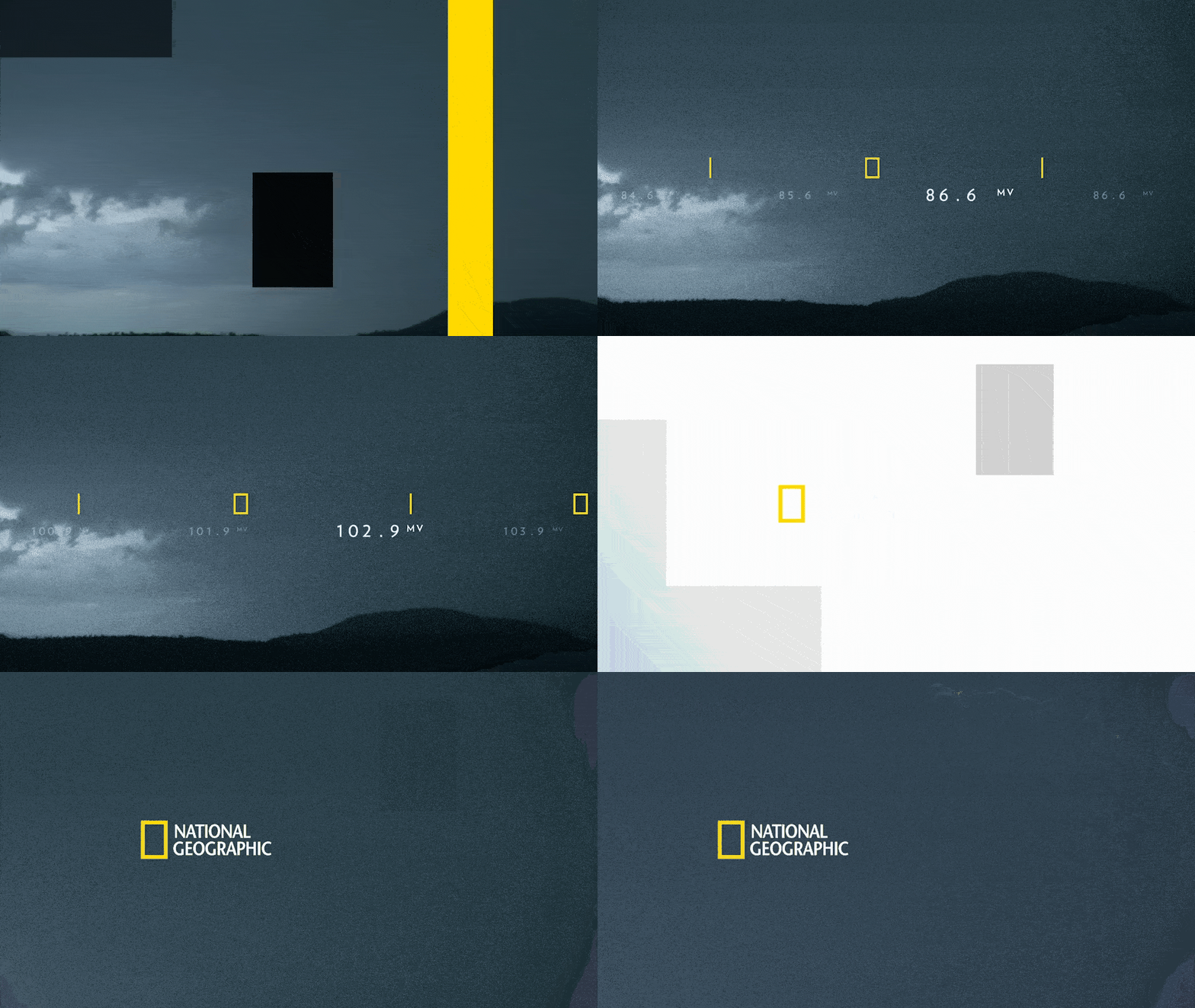
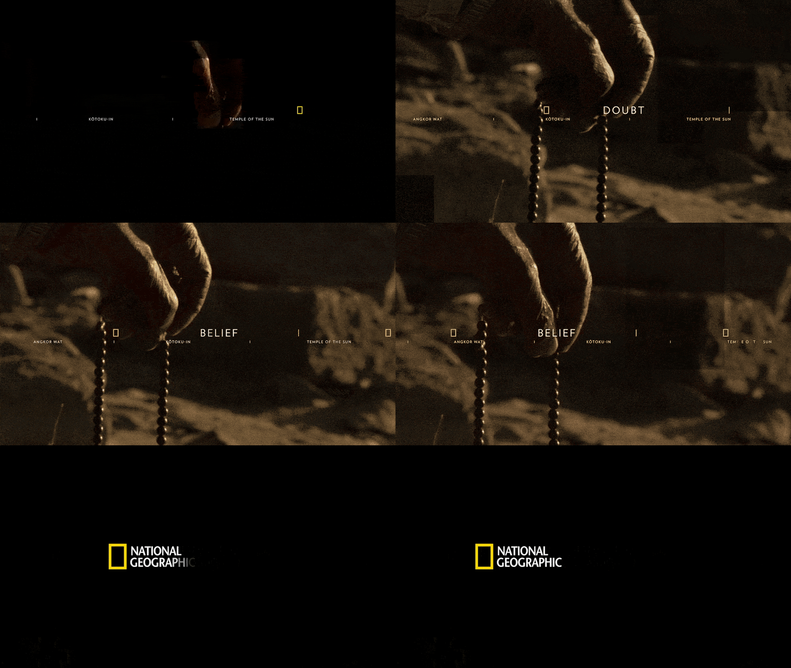
Evolved National Geographic’s iconic visual identity with a brand system that carried the legacy of exploration forward through cinematic storytelling, curiosity, clarity, and emotion.
National Geographic's identity carries more than a century of legacy, so any evolution risked either breaking the equity of the yellow border or leaving the brand feeling static next to modern streaming competitors. The challenge was to carry the idea of going further — deeper curiosity, further exploration — into a broadcast and digital identity built for many formats at once.
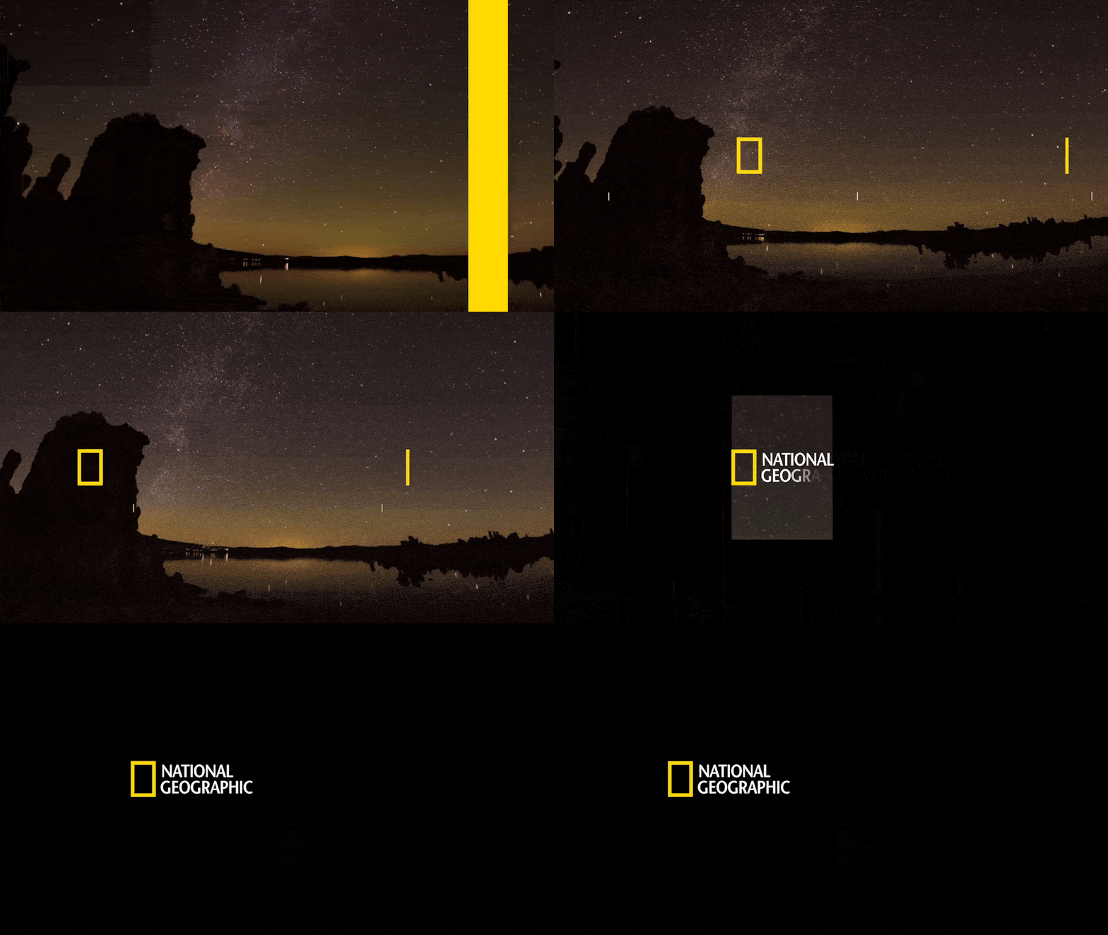
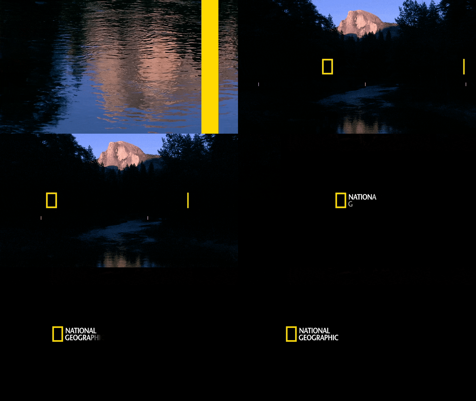
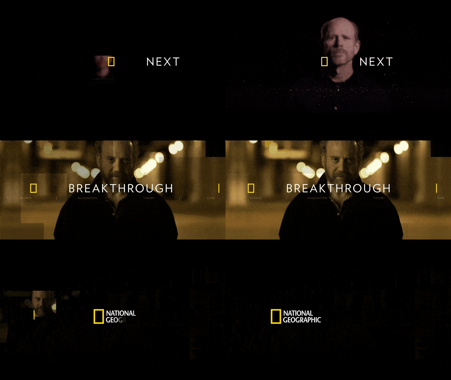
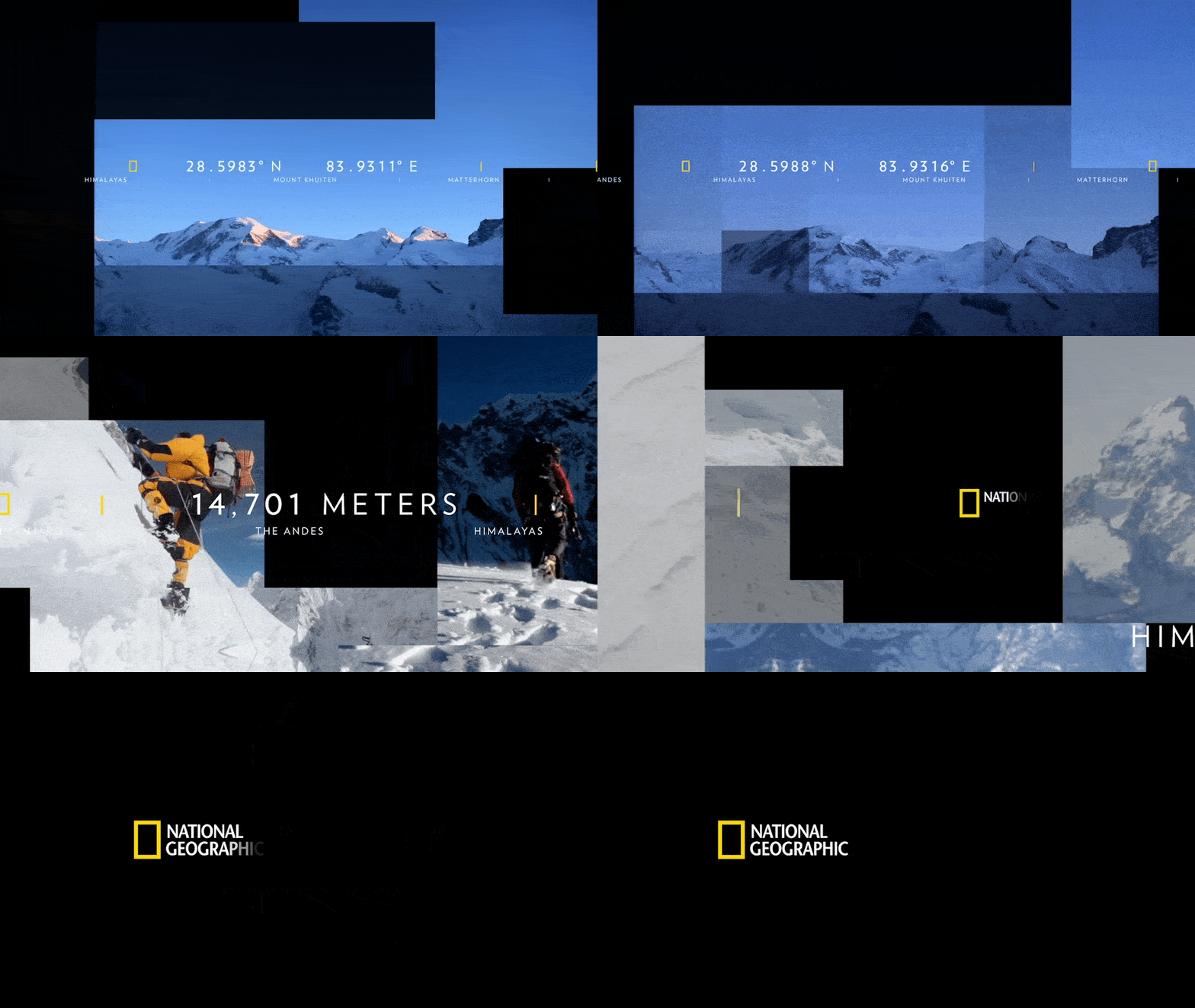
The approach treated the frame itself as the brand device. Optical transitions, window reveals, and countdown and bumper systems used the border as an aperture into footage, so the graphics never sat on top of the story — they opened it. A tightly specified type and color system kept promos, IDs, show packages, and pop-ups consistent across an enormous volume of on-air output.
Deliverables ranged from network IDs and bumpers to promo templates, subtitled slates, and a full branding style guide, giving producers and editors a repeatable kit for daily work. The emphasis throughout was clarity, emotion, and cinematic restraint at broadcast scale.